
Typography. Just another one of those new, fancy buzzwords you should use to sound smart in meetings or is it the real deal?
Maybe a better question is: What is it?
This typography guide will show you what’s what.
Typography is a more effective way when delivering your message through any medium.
As graphics can support and enhance type, communicating with your users happens mostly via the written word – this is in contrast to the advertising, where images and graphics can convey the whole stories a lot easier, even without using much of the written words.
Most successful brands such as Apple and Google, have set an immense effort on their branding through typography.
Typography has played a critical role in strengthening these brands by creating interest in their product and highlighting the brand message.
Building a strong brand identity entails a lot of dimensions and typography is just a piece to fit into the overall brand architecture.
Particularly, if you?re designing marketing or developing branding materials for your company, such as a creative agency you would want the typeface to strike the perfect balance of minimal professionalism and still have the creative look.
Typography is associated with the art and technique of arranging type, type meaning letters and characters as means to communicate.
Therefore, it’s more than just the design of letters and characters, however, it extends to the arrangement, spacing, selection of point size of these letters and characters.
Just to take you back.
At one single point, typography was practised using printed materials ? this was literally rooted in handwritten letter-forms and characters and arranging them in physical space to communicate.
Thanks to computers, where open-source fonts with scalable typography have made it easy to arrange typeface.
However, understanding the typeface remains important, as it encompasses everything even to the web design.
So, every font, letter, and character arrangement plays a part in determining how a message is conveyed.
Let’s get started.
Definition
Typography
As usual, you can be sure to get a glimpse of Wikipedia explanation: Typography is the art and technique of arranging type to make written language legible, readable and appealing when displayed.
This is likewise applied to the style, arrangement, and the appearance of letters, numbers, and symbols created by the process. Typography also may be used as a decorative device, unrelated to the communication of information.
Typography has been considered as work by typographers, graphic designers, art directors, comic book artists and graffiti artists.
The inability to apply principles and best typography practices make typography to encountered fail in achieving its objective: effective communication.
Typeface vs Font
As these two words might be used interchangeably, they are actually different in their meaning.
The rule is this typeface describes the creative work (i.e., what you see). This is the abstract design term used to refer to the way a specific collection looks. In that case, Helvetica is considered a typeface.
To make it simple, a typeface is used to define a family of fonts, for example, Helvetica light, Helvetica Medium, Helvetica Italic, and Helvetica Bold – the various forms of Helvetica make up the complete typeface.
However, the visual appearance of the collection of letters and characters is described as a font. This implies what you use – the tangible representation of that collection of letters and characters. For example, Helvetica Light is a font.
Therefore font would be referred to the single weight or style within its family.
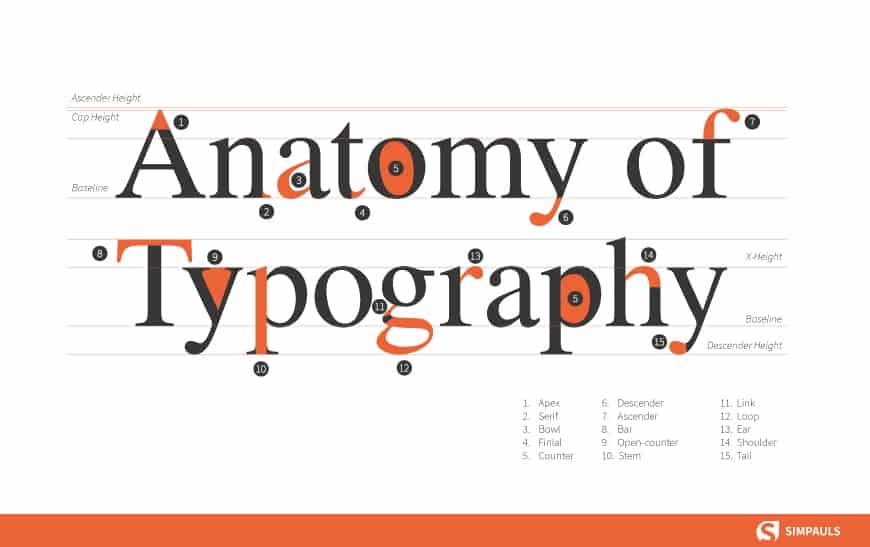
The Anatomy of a Typeface
It’s way easier to when communicating with designers to actually speak their language. This is why it’s important to understand the anatomy of a typeface.
Each typeface constitutes different elements that uniquely distinguish it from other typefaces.
The individual features of particular characters in a font are what we refer to as typeface anatomy – The common features that apply to either a single or two characters in a typeface.
The shape and size of certain elements in a typeface might appear to be consistent and this could enable you to identify and categorize typefaces.
Below is an illustration that depicts the interaction of different typeface elements.

Stroke
Every time you jot down notes, you are actually making strokes. The main diagonal portion of a letterform such as in T, M, or N is the stroke.
The stroke is secondary to the main stem(s). Some letterforms with two diagonals, such as A or V have a stem (the primary vertical or near-vertical stroke).
Other elements such as bowls, bars, arms, and stems, are collectively referred to as the strokes constituting a letterform.
Bowl is the curved part of the character that encloses the circular or curved parts of some letters such as a, b, o, D, and B is the bowl.
A counter is the closed space (white space) of some letters such as d, o, and s. The term counter may sometimes be used to refer only to closed space, while partially enclosed spaces in m, n, or h are the aperture.
The shape and size of the counter and bowl have been identified to be able to affect readability and is also an identifying factor for some typefaces.
A bar is a horizontal stroke across such as the horizontal stroke on the uppercase T, the middle of uppercase A. The horizontal or sloping stroke enclosing the bottom of the eye of an e is also a bar.
The varying positioning, thickness, and slope of the bar is an identifying feature of many typefaces.
The Stem is the main, usually vertical stroke of a letterform. There is only one stem in both lower and uppercase P.
X-height
The distance between the baseline of type and the top of the main body of lowercase letterform termed as x-height (x-height). It is usually the height of the lowercase letters, In this case, it’s the letters? a,’ ?e,’ and ?t.’)
Typeface x-height is a factor that marks identification and readability of type.
Cap height
Often referred to as the height of the capital letters in the typeface. It is the distance from the baseline to the top of the capital letter, in this case, letter T.
Cap height predicts the, how tall the largest letters will be, as well as how big most lowercase letters will be. The size of the typeface is predetermined by these two factors.
Ascenders And Descenders
Descenders and ascenders are the portions of letters that extend below and above the x-height. Descenders may also be referred to the extending stroke on a letterform that falls beyond the baseline.
These typically apply to lowercase letters. For instance, the letter “f” has an ascender (the curved stroke “up” from the letter) while the letter “y” has a descender (the parts that drop “down” from the letter).
The typeface can be classified by this feature of extending stroke either below or above the x-height. The extension of the descenders and ascenders stroke varies among fonts.
Baseline
The baseline is an invisible line where the letters sit on.
Letter Spacings
Changes can be made around the letterform and affect the entire typography.
The spatial manipulation in type spacing can be a very important tool. Some fonts may need to have individual characters adjusted to help create better readability and a more aesthetically pleasing layout.
Kerning
The adjustment of the horizontal space between individual letters is known as kerning. Most fonts will have specific default kerning for individual character sets so that the spacing in between the letters in words feels more natural.
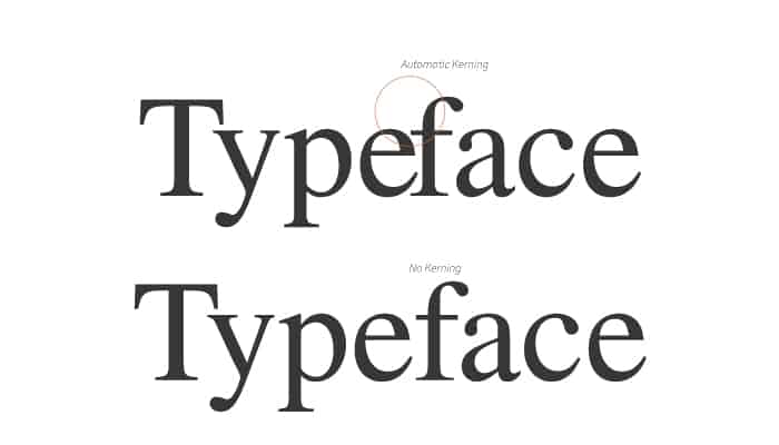

Normally, the process of adjusting the space need to avoid awkward-looking gaps between your letters but improve legibility.
This system of spacing typography may seem as unnecessary detail, but adding it as a quick extra step in a typeface can make a huge difference in helping typography-project look clean.
In most cases, people may not recognize kerning being included to change the type of design.
Kerning is most important for large, highly visible text like typographic logos or headlines.
However, it is not usually done with body text as the gaps between characters at body text sizes is generally not appealing.
Tracking
Similar to kerning, tracking deals with a modification to letter spacing. However, instead of adjusting the spacing between just two characters, tracking is an adjustment to the spacing between all letters an entire word.
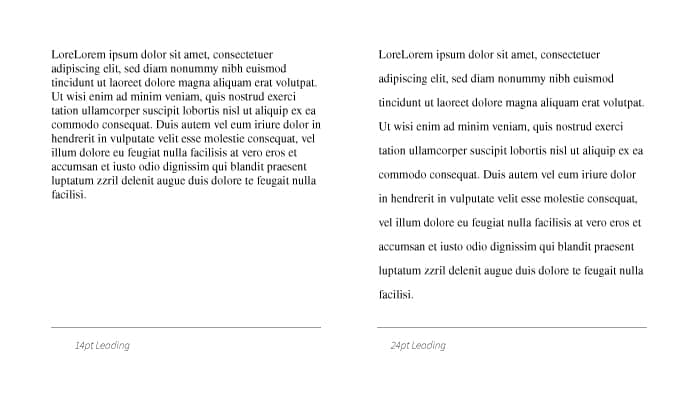
Leading
Leading – vertical space between lines of type (this is known as line-height in website terms).
Leading is the spacing between the baselines of type. The term leading is derived from the practice of placing lead strips between lines type on older handset printing presses such as a letterpress.

Adjusting the leading is also a very useful way of saving or using space on a page. Leading can also be used to change the aesthetics when dealing with a typographical design.
Typography Classifications
Type classification is such a wide scope, especially when extending to the subclassifications. Most typefaces can be classified into serifs, sans serifs, scripts and decorative. However, the two main type classifications are the serif and sans serif.
This classification system is of help in identifying, combining and choosing typefaces.
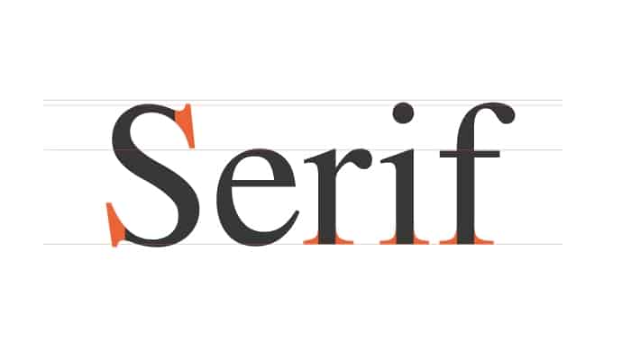
Serif
A serif is the small extra stroke found at the end of the main vertical and horizontal strokes of some letters. The common serif typefaces examples include Times New Roman, Trajan, Georgia, and Garamond.
Body text in most of the books are serif, and the fact is that a serif is considered much easier to read in long copy and printed works due to its distinctive nature of typeface.
Therefore, it would be true to state that, serifs aid in the readability of a typeface especially when it appears in a long block of text.
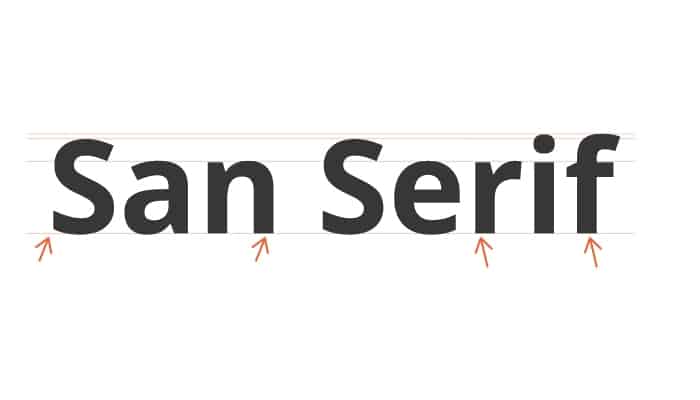
Sans Serif
The typeface with the end of the stroke without serif is called sans serif. This end of a stroke that doesn’t have a serif is a terminal.
To list sans serif typefaces would include Arial, Verdana, and Futura.
This kind of typeface classification has been adopted mostly on the web block text, blog post, and web pages. The reason behind it feels more modern and looks great even at lower screen resolutions.
Script
Scripts are what we might think of as cursive- or handwriting-style fonts.

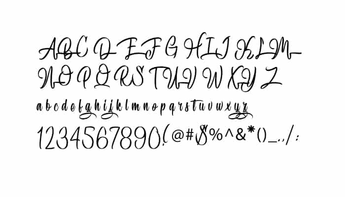
They are more based on the varied fluid strokes created by handwriting. You’ll be surprised that script fonts come in many different styles, from elegant, fun and casual, or even hand-drawn.
Typeface Family
Type family describes the range of typography design that are all variations of one basic typeface.
For instance, Source Sans Pro has variations such as extra light, extra light italic, light, light italic, regular, italic, semibold bold, semibold bold italic, bold, bold italic, black, and black italic.

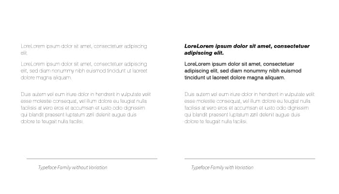
Drawing from a single typeface family brings variation to your typography or design as it keeps it consistent.
This variation also within one family is important in creating a hierarchy – designing so that the most important elements, such as headlines and quotes, stand out above the rest of the body text.
Conclusion
Once you realize how much thought goes into carefully selecting a typeface, it becomes much easier to recognize the differences between typefaces, font and understand how to select the suitable type.
The arrangement of type involves from selecting typefaces, point sizes, line lengths, line-spacing (leading), and letter-spacing (tracking), and adjusting the space between pairs of letters (kerning) have a wide influence in terms of legibility and readability.


