Rebranding can be an effort-intensive process, so there is usually the need to be deliberate on the why and how of going about it.
For a well-executed rebranding process, the proper reputation and image of your corporation, company and brand are most important and evident elements.
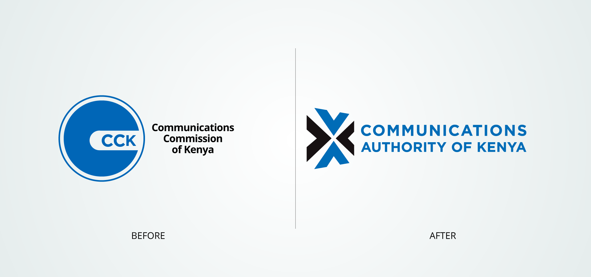
The Communications Commission of Kenya (CCK) recently had a total rebrand to the Communications Authority of Kenya (CA) . The aim was to give the authority a fresh new look as it deals with matters arising involving the communication sector.
There are many reasons why a corporation or company might consider rebranding. Communications Authority of Kenya (CA) added a mandate in the regulation of electronic transactions that include administration of broadcast content, develop media standards, and monitor compliance that called for the rebrand.
Brief History of Communications Authority of Kenya (CA)
This body was established in 1999 by the Kenya Information and Communications Act, 1998 for the regulation of the communication sector in Kenya.
The Authority’s responsibility has been to facilitate the development of the Information and Communications sectors including; broadcasting, multimedia, telecommunications, electronic commerce, postal and courier services.
2004 marked the year in which the Ministry of Information and Communications published the draft National ICT policy. This was adopted in 2006 with an aim at creating an enabled and knowledge-based society by using ICTs to improve the livelihoods of Kenyans.
Communication Authority of Kenya (CA) New Brand Identity
With the adoption of the new name for the authority, the identity needed to be rebranded including the logo, and the brand style guide.

Rebranding is not limited to having a new logo or website. The Communication Authority of Kenya has been able to maintain an entire look and feel of the brand which is intended to reflect on the holistic strategy.
The new Communication Authority of Kenya logo bears the essential principles in the design of a successful identity.
The balance in the logo design by keeping the weight of the design elements, graphics, colours, and size equal in proportion causes the mind to naturally perceive a balanced design and receives it as pleasing and appealing.
A consistent and cohesive strategy that spans all elements including the logo, packaging, signage, flyers, ads, etc. and channels of your brand website, digital, social among others is important to consider when rebranding.
The CA which had a partial rebrand by maintaining their past colour palette and other brand elements, took into consideration the need to make sense to the bodies being regulated.
The authority’s brand identity will remain consistent across the four regional offices that are yet to be opened in Mombasa, Kisumu, Eldoret, and Nyeri.
Conclusion
As mentioned earlier, a brand is much more than a company’s name and logo. However, the name and business logo are key ambassadors for any corporation, company or brand, so it’s important that both are strong.
Before you eliminate everything, consider what may already be working well in your brand. Ideally, some brand elements of your company or business identity may be preserved, so that there’s a feel of continuity when you rebrand.
It would be wise not to lose the elements that already resonate with your target audience. Communication Authority of Kenya (CA) colour palette blue and black has served to communicate their role in the information and communication sector.
Let us know your thoughts about the rebrand of Communication Authority of Kenya (CA) in the comment section below.