Equity Bank has just launched a new brand identity not being the first brand to have had a major rebrand in Kenya this year. Rebranding has never been an easy thing to crack especially if it encompasses having a fresh new look. Regardless of the company size without approaching your rebrand strategically, your business runs a significant risk of losing a lot of time, money, and market share.
Often times it is important to start by understanding branding and why you may need to rebrand before the implementation of new brand identity, logo or website. Learning from companies that have had different outcomes from their rebranding strategy we are able to master on the do’s and dont’s of rebranding.
With the new brand identity for Equity Bank which dropped the name Group, Bank, Insurance, or Investment, they emphasized the use of wordmark (logotype) ‘Equity’ that makes them stand out in their commitment to transformation and regional expansion.
With the need to engulf its product under one roof that included; banking, insurance, and investment. The rebrand came at the opportune time informing the adoption of only the wordmark Equity.
The recent rebrand of Equity Bank stands to be a major milestone as they celebrate 35 years since it was founded and have grown to have a remarkable market share in Kenya. The bank has been well known for its commitment as a financial institution among SMEs in Kenya for growth and social impact.
Right from when it began on its journey of transformation to modernize it, the brand has done all it could to get closer and better their service to its customers, according to Equity Group CEO and Managing Director Dr James Mwangi
New Identity
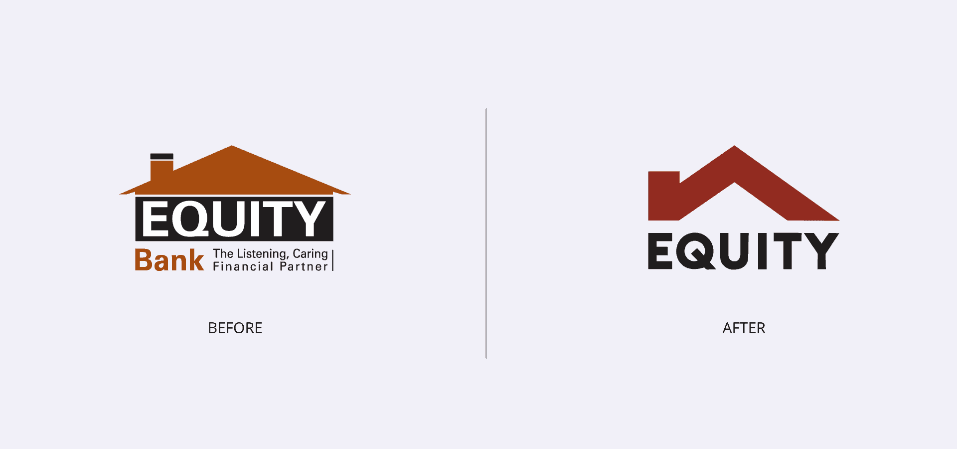
The new logo for the brand incorporates the balance between the house graphic element and the (wordmark) logotype that makes it distinct from the previous identity. The adoption of a simple house illustration has generated numerous reaction as Equity Bank stand to mark a new phase in the implementation of their strategy to scale on their market within the region.
Our belief in change and transformation has led us to this moment. From today, we retain the best from the past while introducing the best of the future #ANewLookEquity pic.twitter.com/48oezSEoTS
? Equity Bank Kenya (@KeEquityBank) October 3, 2019
The colour palette of the brand too was redone with the use of two swatches making the logo still identifiable from a distance.
Related Article: Pewin Cabs Move To Rebrand As PTG Travel
The use of the grids had been adopted in making the logo quite firm with its strokes and has the boldness in the statement that it portrays.
Dropping of the types in the logo to be just Equity would be something for its customers to adopt who are used to Equity Bank.
What do you think about the Equity Bank rebrand? Let us know what you thought(s) in the comments below.