A logo is a key element of a company’s brand. It is not the brand but has a solid impact on how the brand is viewed.
Any good design is as strong as its collaborative effort which includes logos. A design’s main purpose is to solve problems by offering visual solutions.
As a design, a logo is a communication tool to offer clear information without speaking and achieve specific outcomes. It should offer relevant information to the target audience. Therefore, it is important to ensure that its design is the best and no compromise is tolerated in the design process.
A good logo is subjective and based on the preference of the person interacting with it. What one may find to be a good logo, another may not. However, there are principles to be observed that cut across the board despite any personal preferences one may have.
The following are some of the issues to consider in evaluating a logo design.
Expression of the Brand
A good logo should communicate the company’s brand. As one of the first things someone sees when they visit a website or interact with a brand’s material, it should project a good impression of the brand.
A good logo communicates about the brand from the onset, leaving no room for doubt in the customer’s mind.
Cross-check its uniqueness to ensure it is sending a message that is coherent and supports the brand’s purpose and goals.
Consider its simplicity and ease of understanding and whether it bears elements contributing to the brand identity. Check whether it is well executed and communicates effectively in both its looks and message.
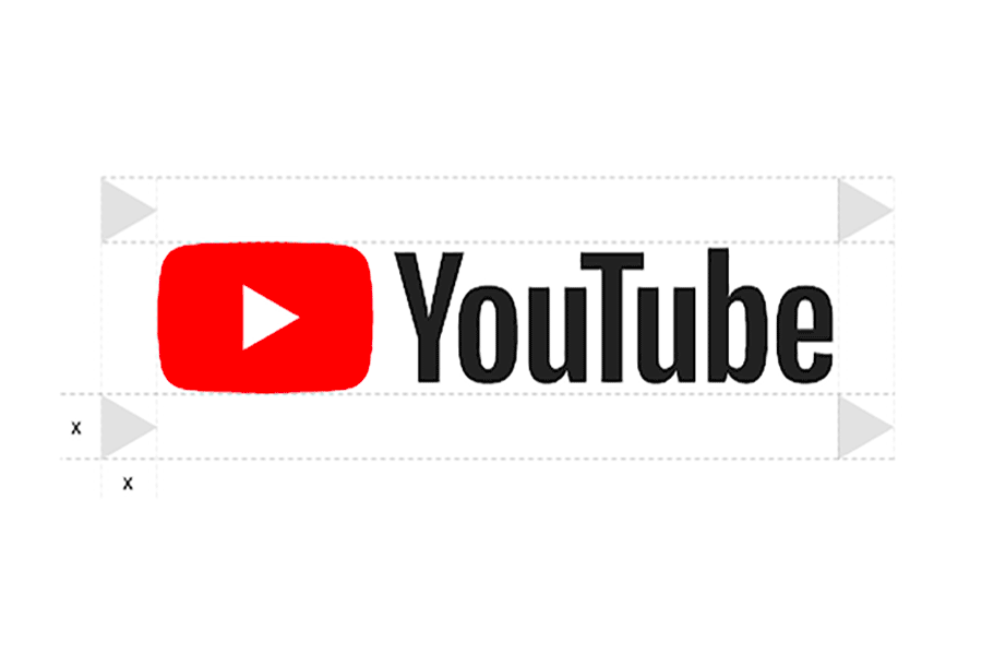
YouTube’s logoor example, both the icon and name convey its intention to the users. The icon, a whitea seen and ad play button represent the brand’s purpose to convey its commitment to share videos with just a click.
Its name conveys the message that the user has the freedom to gain information and watch what they want unlike traditionally where information was reserved for watching television only.
Aesthetically Pleasing
A great logo should look good and beautiful and at the same time demonstrate credibility and professionalism. Uniqueness is the first element of an aesthetically pleasing logo.
A logo design should not embrace clichés or what is common in the world. For instance, not all logos that have a globe represent their reach to the world and so at times, it may be pointless to have a globe as part of a logo.
Originality is key in the process of creating a logo. Copycatting is one of the wrongs a logo design can have.
While it is good to beware of what other competitors have and the general appearance of logos in the industry, the design should differentiate your logo from the competitors. It should clearly communicate the brand’s identity.
It should also be adaptable in different spaces and be able to stand alone in any place. It should be tested on different materials and colour backgrounds to double-check its appearance. It should appear pleasing in different areas i.e. for instance the Apple Logo is pleasing whether you see it on a billboard or on a pen.
The logo should also be balanced on the surface on which it’s placed and should show proportionality and symmetry.
A good logo will show equality in its appearance and a balanced structure of the logo design both horizontally and vertically. On the Twitter Logo, the bird’s positioning and structure are proportional and balanced through the unseen multiple circles.

Recognition and Memorability
A good logo is easily recalled at the first glance of interaction. While simplicity is important in logo design, it should also stand for something singular. The logo should embrace modern features although it should not be engulfed in being trendy that it loses itself in details. It should be easily recognized whether near/far or in large/small size.
A less stylized and more restrained logo is good especially if it gives the details about the company’s brand. The description of its basic elements should be clear such that it sticks in the minds of the users. Coca-Cola for instance has maintained its logo as well as packaging for many years and anyone from the young to the oldest can easily tell it.
In examining a good logo design, determine the symbol representing the visual anchor of your logo. Create a logo that is too trendy yet doesn’t feel outdated. The logo should create a connection with the customer and make them feel interested in the brand.
Functional
A logo should serve its function and relevance for your brand per the style guide. Whether it appears in both tangible and digital environments, is it serving the customer’s needs by giving them the information they are looking for? The logo design should fit into the customer’s mind and help them overcome their needs.
Consider the versatility of the logo since it may appear on different materials i.e. billboards, websites, pens, social media, key holders, packaging materials, clothing etc. Will it lose its function or people will be glad to be associated with it? The logo design should serve its purpose anywhere.
Finally, check its appropriateness for the industry. It should bear the language of the industry i.e. medical, transport, telecommunication etc. and fulfil the needs of that sector, compelling users to take action. The texture, pattern and colours should also appease the target audience i.e. a colourful logo for a children’s toy store.
Conclusion
Having a simple and good logo isn’t enough but having the right one matters. The appearance of your logo will determine whether they will stay on your website and want to know more about the brand or not.
Evaluating a good logo is key to a brand’s success and therefore taking a step back and examining the logo design is crucial to determine its viability and usefulness.
