Java House was established in aim of introducing a gourmet coffee drinking culture in Kenya. Kevin Ashley opened the first outlet, a coffee shop in Nairobi at Adam’s Arcade in 1999. The brand then evolved to an American diner-style restaurant and gradually to its present-day status as a 3 -day part coffee-led, casual dining concept.
Today, it is among the leading coffee brands in Africa with outlets in Kenya, Uganda, and Rwanda.
The Java slogan ‘home away from home’ has been adopted in the rapid expansion into other markets. This has seen the birth of other sister brands such as Planet Yoghurt a frozen yoghurt store and 360 Degrees Pizza, a casual dining restaurant.
This expansion of Nairobi Java House which happened in mid-2013 created the need to convey this evolution. The rebrand, therefore, was by ARK Africa who worked to create a refreshed identity.
Identity
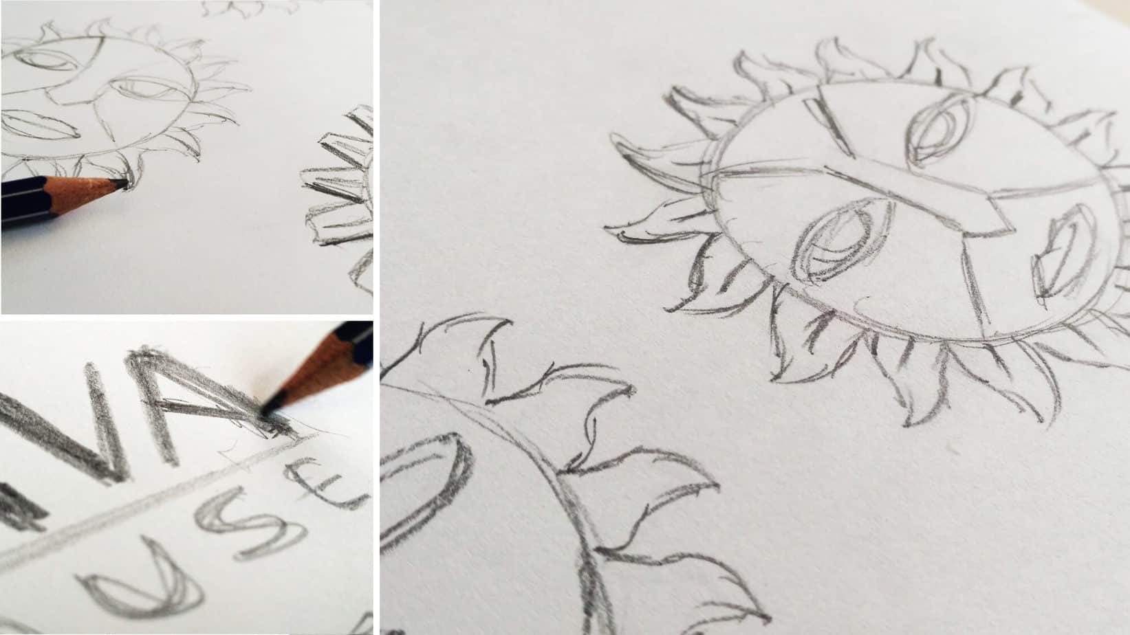
The wordmark of Java House previously Nairobi Java was described as having features that would be redundant over time. The retro typeface element symbolized an established brand but lacked notion of the future. Overall, the previous logo would be limited in functionality as compared to the growing change of the brand.
![]()
![]() This resulted in the inevitable need to have an identity that would dutifully differentiate Java House. This would include the design of a more modern, cleaner typeface that borrowed from the previous logo’s layout, allowing a seamless transition.
This resulted in the inevitable need to have an identity that would dutifully differentiate Java House. This would include the design of a more modern, cleaner typeface that borrowed from the previous logo’s layout, allowing a seamless transition.
![]()
The iconic identity of the sun among other essential brand qualities such as being recognizable was successfully retained. The revision process would see the careful retention of these familiar elements. The mark being African and feminine discloses the African spirit of warmth, care, and hospitality.

UX & Website Design
The rebrand would also be seen being adopted in the website design . The beautiful and functional experience across all customer touch-points was as well duly effected.
As the concept of adaptability for any platform is key, a responsive site was applied to give the online brand experience a personable and quality feel. The rebrand also ensured that the development of the tone was more conversational.
Print Design
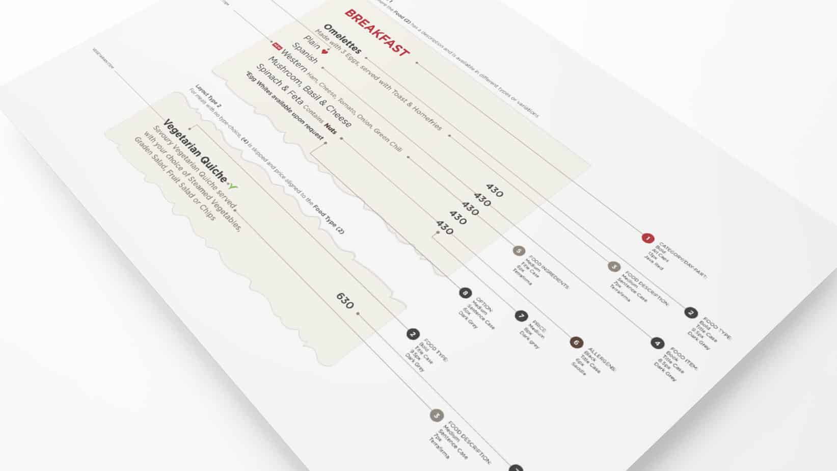
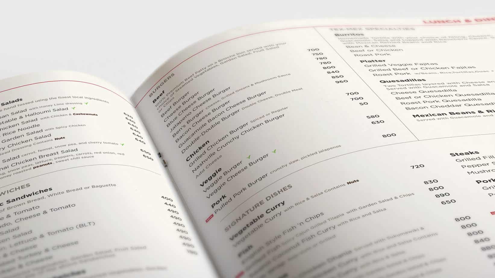
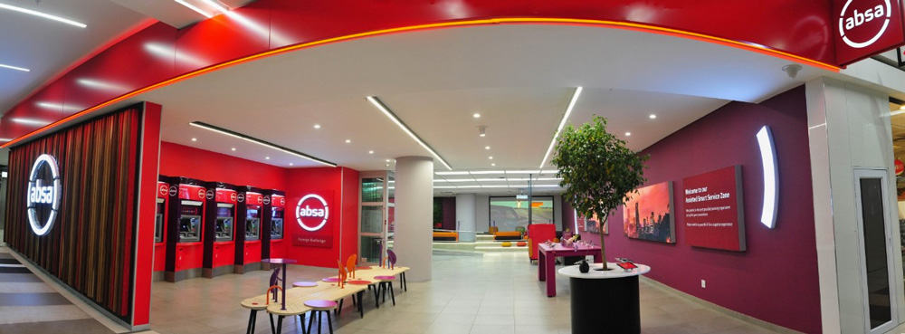
The collateral lines of the brand also had the application of the new identity with improved usability, legibility, content flow, and brand alignment. Java House rebranded collateral included menu, signage, wall hanging among others.
Conclusion
The overall performance of any rebrand would depend on the process adopted in the rebrand and the cohesion of the elements needed to be reworked. Java House rebrand maintained consistency together with the customer experience being tied to the service being provided by the chain of Java House store.