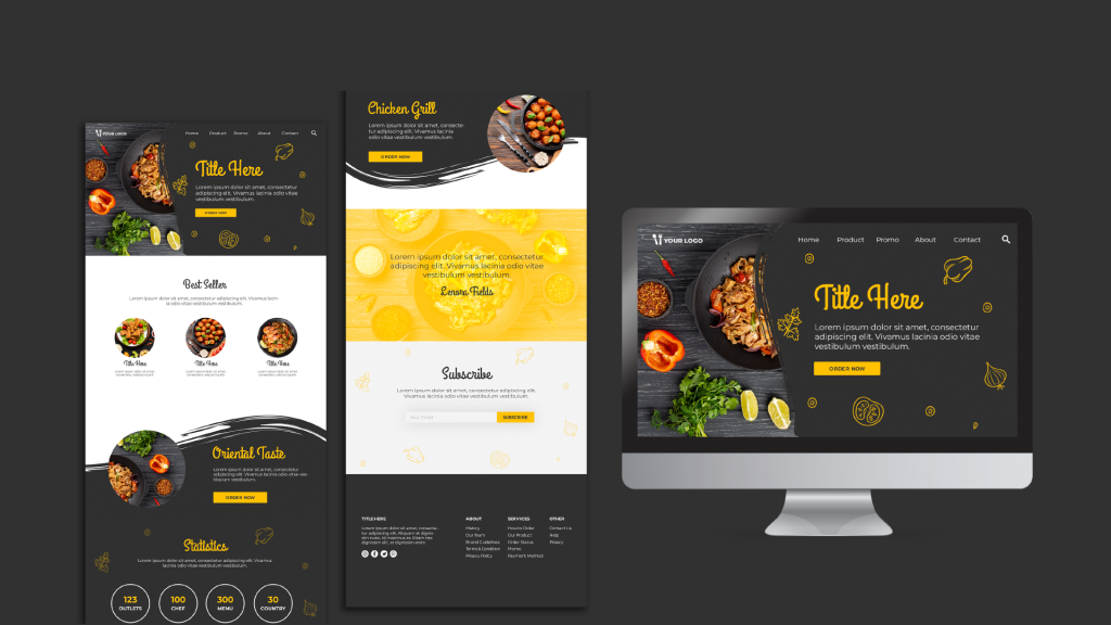
Did you know that there are over a billion websites on the Internet? Statistics reveal that nearly 109 new sites are created by the minute. This shows how much harder website owners have to work to grab the attention of their target audience.
One feature that improves this chance is choosing the right layout. An eye-catching design keeps visitors engaged. Conversely, a cluttered design causes distraction and confusion, increasing the likelihood of users leaving. To help you start on the right path, I’ll highlight five main types of website layouts.
Let’s dig in:
Website Layout Types
Z-Pattern Layout
The Z-pattern layout is one of the most popular, and for good reason. Here’s the deal: our eyes always follow a pattern similar to the letter Z whenever we visit a webpage. The specific direction they follow is:
- The first spot to see is the top left corner, then the top right corner
- Our eyes then move down to the left
- Finally, they move across to the right
Based on this, the Z-pattern layout leverages our natural eye movements to capture visitors’ attention. It means information is spread based on relevance, with the most significant details in the top left corner.
Here are a few tips to give you an idea of what this layout looks like:
- In the top left corner, display the business logo so it sticks in the viewer’s mind.
- Add a navigation menu in the top rightmost corner, making it easy for users to get around the rest of the website.
- Diagonal section of the Z shape – most essential details represented in striking typography, visuals, and insightful lines of text.
- The bottom of the zigzag – should include a call-to-action.
Full-screen Image Layout
This design entails picking a spectacular image, representing your brand/brand message and filling it on the entire page. This picture can also double up as a background.
Remember to make the content on this page visually appealing as well. Use high-contrast or visible colours despite the full-screen picture.
Also crucial to note is that a full-screen layout works best for businesses that offer single products. You don’t want to draw visitors’ attention to just one product if you offer variety. Let’s say that you’re designing a website for a financial consultant. You could showcase a picture of a couple lying on a gorgeous beach resort accompanied by the title “Achieve Financial Freedom!”
Split-Screen Layout
This is exactly what it sounds like: a layout where the screen is split into two distinct parts.
This design allows you to display several pieces of information. The best part is that each half gets equal attention, which means you’re not giving precedence to either one. Split screens are further divided into:
- Vertical split-screen – this layout divides a web page into vertical sections.
- Horizontal split-screen – in this case, the web page is divided into two horizontal columns.
- Asymmetrical split-screen – the division of the web page is not even. As such, one section may be bigger than the other, allowing for more content to be displayed.
- Diagonal split-screen – the split is done diagonally, resulting in two triangular parts.
While visually appealing, a split screen isn’t suitable for all applications. It’s only ideal if:
- You want your site to have visual contrast between two things – for instance, brands that sell both men’s and women’s attire
- You’re looking for a modern, edgy design – it makes your site have a stylish, contemporary look
F-Shaped Layout
Like the zigzag design, the F-shaped layout also takes cues from typical page-scanning behaviour.
The concept behind this layout is that humans tend to view web pages the same way they read books. This means some people typically start at the top leftmost corner and read to the end of the line before proceeding to the following line. This creates an F-shape layout.
With such a design, visitors will typically hit pause when they get to the end of the line, and again as they start a new line. This means that any content displayed on the extreme left and right sides is more likely to be seen. As such, you should place the most vital details in these areas.
Single Column Layout
Another website layout worth considering is the single column. What this means is that all the content is included in one vertical column. This leaves ample room on the left and right sides to add more information if needed.
The greatest advantage of this design is the ease of navigation. All users have to do is to scroll downward if they wish to read more content. That said, it’s always nice to offer visitors a “back-to-top” icon to ease navigation further.
Similarly, remember to break up text if you plan to include a lot of content on a particular page. You don’t want readers getting bored or feeling overwhelmed by the amount of information. Breaking up text can be done by including images, videos, headers and sub-headers.
Which One Is Right for You?
Not sure which website layout to use? You can narrow down your choices by considering the following factors:
- Your content goals – before you pick a particular layout, consider the content you want to display. Would you like to showcase your portfolio of tasks? Perhaps, market your products? Or are you looking to engage users in another way? Whatever your objective is, keep it in mind before picking a design.
- Your target audience – another factor to consider is the target market. Specifically, take their pain points, preferences, and behaviours into account. For instance, if your website aims to engage seniors, you’d choose the most user-friendly layout possible.
- Mobile responsiveness – increasingly, people prefer to access sites through their mobile devices. So before you settle on a particular design, ensure it’s mobile-responsive as well.
Types of website layouts for different needs
When you’re configuring your website, one of the most crucial factors to consider is the layout. Not only does it determine the look and feel of your site, but also its usability and functionality.
As such, you should take several factors into consideration. These include your content objectives, target audience, and mobile responsiveness. Based on these, you can choose between a Z pattern, f-shaped, full-screen, split and single-column layouts.


