A logo contributes significantly to a company’s success. It says a lot about the company by displaying what it does, and why it is unique and evokes emotion in customers.
As such, designers are tasked with the responsibility of creating a symbol that acts as a visual manifestation of the company’s brand. This article will elaborate further on what a logo is, and how to make a good logo.
To get started,
What is a Logo?
It is a text, image, shape or a combination of the three used to display the name and the purpose of a company. Its primary goal is to identify a brand, a product, an individual or a service.
If well-designed a logo can tell a company story by conveying the brand’s message in a way that resonates with the target audience. A logo also:
- Helps a company or business create a brand identity
- Creates a good first impression which invites your audience to interact with your brand
- Promotes brand loyalty
- Differentiates a business from its competitors
- Creates a symbol people can use to remember the company
Source: Mailchimp
Elements Of A Logo
Several components come into creating a logo that helps a brand stand out. Here the basics:
The Style of the Logo
It is a crucial aspect of a logo as it determines whether the company uses a stylized representation or a simple icon. There are five types of logo styles companies use:
Wordmarks: Renowned brand names (CocaCola, FedEx) use text-only logos designed in unique fonts and styles
Brandmarks: Here the company uses symbols or icons on their logos. They are more recognizable than words and easy to change. For example, Twitter’s use of bird only an icon for its logo is so identifiable and relatable to users
Lettermarks: This style is based on text, but the logo uses an abbreviation or initials. Lettermarks are ideal for companies with long names that don’t want to use simple logos. CNN and P&G fall in this category
Combination Logos: Here the company includes a fitting symbol and text when creating the logo. The style is ideal when the company name does not convey what it is engaged in and when it wants to make an unknown brand name relevant to the target market. Adidas, Sprint are excellent examples of companies that use this logo design
Emblems: Company logos created in this style have texts insider the icon and are more detailed. Companies like Starbucks, Harley-Davidson use this logo styles
Colour
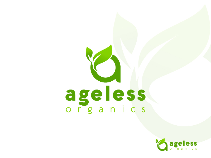
Source: Ageless Organics/ A Letter logo design.
Colour creates the aesthetic appeal of the logo. It also evokes different impressions on your target audience. A red colour, for example, is believed to be beautiful, bold and youthful; and can cause you to feel hungry.
Read More: Color Matters – Meaning of Colours
Most companies are inclined to use blue in their logos as it creates a professional look. Decide if you want to use a single colour or several colours. They should resonate with other branding materials you intend to use.
Typography
Source: Dribble
The typography used to create the logo reflects the personality of the brand.
The most common types are Serif, Sans Serif, Script, modern and display fonts. Serif font is ideal for creating a traditional, reliable and professional feel while Sans Serif is excellent if you want to create a clean, modern and readable logo.
Script font creates an artsy, fun and distinctive touch to the logo while the modern font conveys a feeling of style, strength, and progress.
Companies use display fonts to draw attention; it can be bold, large, fun and friendly like that used by Disney.
What Makes A Good Logo?
Source: Dribble by Akash Mhaske
Apart from the essential components of developing a logo, several features go into creating a great logo.
Here are features that make a good logo:
Simplicity: A simple design expresses a brand’s personality effectively and accurately because it focuses on highlighting the essential elements of the company.
Relevance: A great logo should be relevant to its target market. A designer achieves this by using colours that trigger different emotions in consumers and fonts that communicate the tone and the value of the brand.
Last a lifetime: A good logo should not just follow the current design trends but should remain relevant to users now and in the future. Timeless logos focus on the quality of the elements by showcasing the brand’s core values and using simple colour palettes.
Memorable: If your target market can easily recall the logo, then it is likely to connect with the brand.

