


When it comes to making a strong and effective impact with a logo, good design is key. Most designers look to create appealing brand identity designs with thoughtful messages that portray the business as well as possible. Sometimes a simple icon does the trick, while at other times, you need a powerful illustration to make a point. Illustrative logos can and have helped put corporations and businesses on the map. Think of Shell and Starbucks. The designs are elaborate, detailed and feature a lot of elements that connect with the audience immediately.
As a graphic designer, you want to design a logo that attracts the target audience of the business and is also meaningful in one way or another. With an illustrative logo, you can achieve that success and also make your mark in the industry. If you are looking for guides on how to design a retro type of illustrative logo or inspirations to design one, then you have come to the right place!
These are a few tips that might give you an idea of how to go about creating such illustrative logo designs.
1. Visualize and Put it on Paper
This sounds like an easy thing to do but a lot of people skip it entirely. Basically, when you set out to design an illustration, it’s always a better idea to visualize it and draw a rough sketch on paper. Take a look at one of the iconic Guns N Roses Logo. It has been stated that the creation was the idea of a band member who first put it together on paper quickly. The brand identity symbol was refined by an illustrator and became globally recognized.
![]()

Image Source: Dribble
2. Use shapes and lines
Play around with basic shapes and lines to create a logo with a retro effect. Whether you use lines to create effects on the shape or you use them to create shapes, it’s up to you. The end result should be aimed to impress your audience with the detailing like in these Sound Cloud, IBM and CISCO logo designs.


Image Source: Genlogo.com
3. Make it Adaptable and Versatile
Your logo might require a few changes over the years which is why it’s important to have an illustration that can be revamped easily. The Kodak logo has always managed to make a point with its timeless design that has only been through a few tweaks in the years past. The important factor here is that your logo should be illustrated in a way that it remains versatile and is able to adapt easily to digital platforms as well.
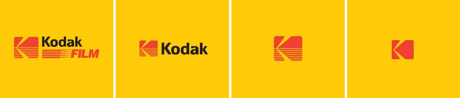

Image Source: Fabrikbrands

Image Source: Fabrikbrands
4. Add a Friendly Character
With illustrations, it’s easy to create a unique character or mascot which could portray your brand to your audience. This way it becomes memorable and also tells the viewer that the business or brand is approachable, like a friend, like a lab chameleon. The chameleon character has managed to make the company into a household name.


Image Source: 99designs.com
5. Create a Landmark or Scenery
If the company is based near an iconic landmark or sources its products from a beautiful region, you can incorporate that into the illustration. Premium Scenery’s illustrative symbol has the mountain of Matterhorn in it. Similarly, the Deep Draft Brew features the turbulent waves of the Pacific.


Image Source: Designcrowd
6. Represent Your Industry
Illustrative logos that represent the business or industry in some way can certainly help them reach their goals faster. If you think about Red Lobster and Harvard University logos, all of their illustrations are able to give the consumers an instant idea of what the organization is offering.
![]()

Image Source: Logos-world.net
7. Be Literal
While you might want to keep the mystery in your brand identity design, being literal can work in your favour as well. In an illustrative logo, you can make your point and give the audience something to associate the brand with. The Shell logo is one example of such a design as well as Blue Circle a cement manufacturing company.
![]()

Image Source: Wikipedia.com
![]()
Image source: Wikipedia.com
8. Put the Text in Last
One of the essential parts of the logo design process is choosing the font and adding the text. If you want to make sure that your illustrative design turns out to be impressive and instantly appealing then you should keep the text for last. There are several illustrations that are combined with wordmarks so the final logo makes a stronger impact.


Image Source: 99designs.com
9. Use Animal Imagery
If you take a look at some of the examples here, you will realize that quite a few illustrative logos use animal imagery. It can help highlight the message of the brand and engage the audience through the animal’s characteristics. These symbols are also used to show power, dominance and performance so by incorporating them in the design you are creating a positive identity.
![]()
Image Source: 99 Designs
10. Personalize It
With illustrations, you can have hidden elements in the logo design that are associated with the brand’s origin story or are personal to the business owners. If you look closely at Wendy’s logo, you will see the word ‘Mom’ written on the girl’s collar. It forms a connection with the consumer and reminds them of family and home.
![]()
Image Source: Clean png
To Wrap it Up
These tips might be able to help you come up with an illustration for a brand identity design that hits the mark from the beginning. If you try and keep a few in mind, your logo will boost a brand’s value and make it recognizable within the industry.