A brand style guide is important for a company or organization in communicating your brand values, mission and goals. The choice of typefaces also contributes widely to relaying this to your target market.
Different kinds of brands adopt the various format of fonts and font pairings. This may result from the interpretation of design, and absorbed throughout company culture. The bottom line fonts tell a story by bringing a voice and personality to your work. From print to digital work, a well-executed typeface would engage your audience ? while a shoddy font pairing one can negatively impact your company.
Whether you’re building your brand from scratch, reworking your logo or updating your website, we’re here to set you up with the right font choices so you can put your best foot forward.
Considering most of your market communication would be through your choice of type while the first impression maybe also through the choice of type. You might consider the chosen font that matches your aesthetic right from the logotype. However, this should limit having a secondary font together with a clear body copy type.
Let’s get started with the guideline to help with finding typefaces that work best for your brand.
Type of Fonts For Your Brand
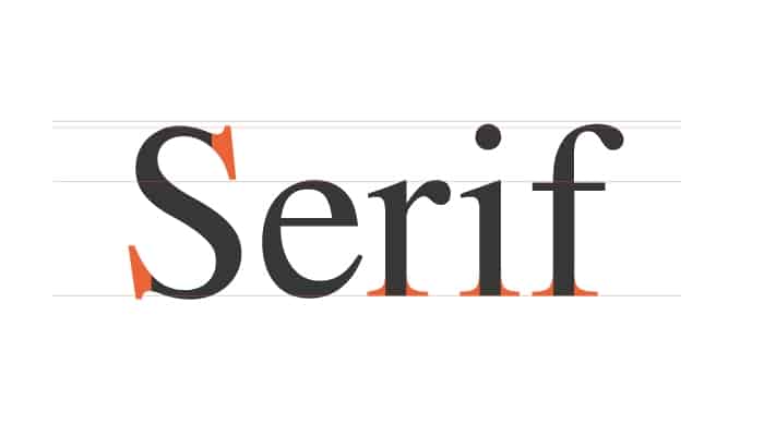
Serif Fonts
A serif is a small extra stroke line at the end of a character’s stroke. For a long time, they are considered to be the easier type to read and classy. Not to forget the example is Times New Roman the most popularly used.
Serif fonts are mostly the good choice for long copy paragraphs of text such as books and reports for the fact that they are highly legible and our eyes are accustomed to their shape.
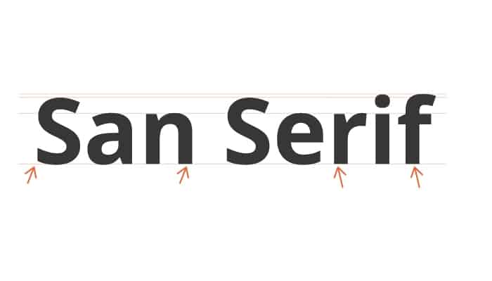
Sans Serif Fonts
These fonts don’t have the extra stroke at the ends of letters Sans-serif (without serif). They have been adopted mostly on the web block text, blog post, and web pages. San-serif is the best for a modern look, they adapt well for lower screen resolutions.
They also are great for general readability working very well for the fine print. Use of this type often times symbolize strength and clarity having a clean look to any project used.
A San Serif font family with variable weight can be used to communicate different tones. For a thick sans serifs are masculine and hardworking, while thin line version looks glamorous and noble.
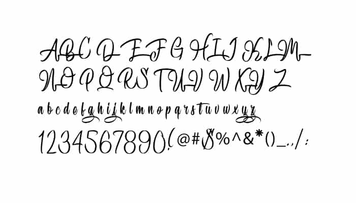
Script Fonts
Scripts are what we know as cursive- or handwriting-style fonts. A wedding company might consider having cursive font having a unique representation of their brand.
They are more based on varied fluid strokes. Script fonts come in many different styles; elegant, fun and casual, to even hand-drawn.
As they are more decorative they are not recommended for long paragraphs of text.
Decorative/Display Fonts
Fonts categorized as decorative, display, or novelty, literally means the font is meant to grab your attention. Often time these type of font drive in evoking very particular feelings.
Decorative Font is never a good choice for body text fonts or as a secondary font. Use of trendy type within this category might weigh down the effort of your brand consistent over a range of years.
Consider using this font classification for a specific effect or purpose as they are often more unusual in appearance.
Choosing The Best Font Type For Your Brand
The selection of font might be overwhelming especially since there are many fonts being design every other time. As you can be definite on the choice of font being the one that suits your brand, however, there are fonts choice that wouldn’t be best and appropriate for a given brand.
Read More: How to Choose the Right Typeface: A Comprehensive Guide
The best example would be a kindergarten might not be considered the use of a formal font that connotes seriousness and official message. For the case of a finance firm having a block font such as sans-serif, would communicate the formality from the typeface.
The Typeface Basics
The initial step of that should be of concern as a brand when choosing a font should be to match the message or purpose of your design.
Research on the best way to express the values of what you wish to communicate through your design. Note every typeface has its own mood or personality. It may be serious, casual, playful, or elegant based on the form of the typeface.
Determine what a particular font communicated and whether that fits with your brand style. Run an analysis on whether the font choice supports the qualities of your brand or complement the purpose of my design?
Consider the most effective font choice that does that.
Consider the context and your audience
A rule to note, never allows personal preferences to get in the way of font selection for your brand style. A font you might think is distinctive or stylish may not be useful or appropriate for your brand or audience you’re working for.
Where and how your design will be viewed should also be included in your font choices. For instance, a business card design will need a font that’s easily readable at a small size. Or social media graphics, mostly viewed on mobile devices, would require fonts that display well on small screens.
Also, have the perspective of your reader. Who is your audience or what is your demographic? Will your font choice resonate with them?
Font readability
Readability is a necessary quality in a font to make sure your audience can respond to your message. A brand’s message could be easily misinterpreted in the case of the illegible font hence not matching with your brand personality

Here are a few guidelines to help determine font readability:
Size: Choose the point size that fits your design context. A business card will need a different sized font compared to a brochure or a flyer.
For instance, try applying your brand’s font in various sizes (points). The ability to read it at a smaller size connotes that it is well on small screens.
X-height: This is the distance between the baseline of type and the top of the main body of a font’s lowercase letters.
The x-height proportion to the typeface capital letter may improve readability even when it is at a smaller size. However, it would be a challenge to read if the x-height and the capital letters cannot be to distinguish. This also makes it even more difficult between font cases.
Spacing: Changes on the spacing around the letterform so that it’s appropriate for your design is a huge factor in enhancing readability.
A brand guide may illustrate the spatial manipulation in type spacing to improve readability. Some fonts may need to have individual characters adjusted to help create better readability and a more aesthetically pleasing style for the brand.
Conclusion
Fonts are most powerful when used in opposition and support of other fonts, especially ones that provide contrast.
There are two basic ways to do this: either the use of two complementary fonts from two separate categories or by mixing two styles from the same family.
For instance sans serifs work beautifully as a secondary font for section headers, especially if your body copy is a serif. While on the other hand, using a font in bold caps for heads and smaller, regular weight for the body creates the same pleasing contrast.
Regardless of the choice of font, you use for your brand, and the mode of combining the fonts, it is important to ensure that your desired brand perspective is clearly communicated through your design.
With this guideline consider choosing the font that matches your style guide in order for your company’s effectiveness and cohesiveness in marketing.
