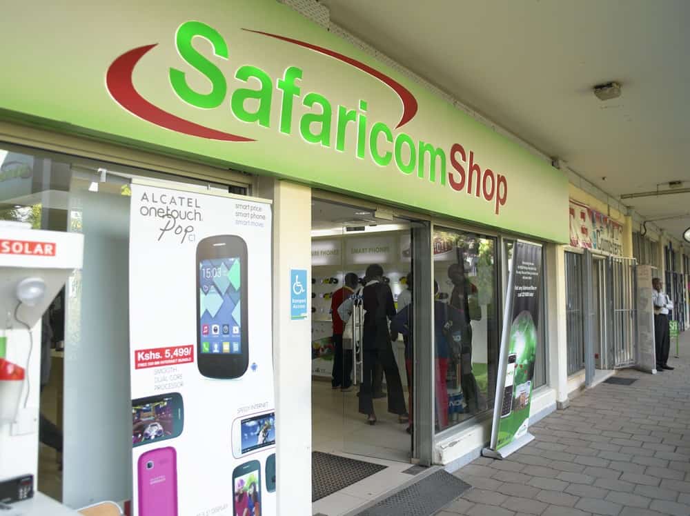
The popular green wordmark design has always been an essential aspect of Safaricom’s business model.
The success of a company needless to say, is influenced greatly by the design of their digital platform and their website .
To this end, the Safaricom logo has played an important role in the company’s design layouts. It has served as the thumbnail for the Safaricom app and is displayed dominantly in the website.
In recent years, Safaricom has embarked on e-commerce with Masoko which has taken the market by storm, giving rise to a number of truly revolutionary businesses.
While a number of companies have cashed in on this trend, Masoko has unlocked the untapped e-commerce market in Kenya by connecting consumers, merchants and vendors to each other using a powerful online portal.
The amount of success Safaricom has been able to achieve in their short history is remarkable, and in this article, we’ll take a closer look at the origins of Safaricom as well as the role their logo has played in the company’s historic success.
Brief History of Safaricom
Safaricom’s journey with a view to Transform Lives began in 2000. Safaricom listed as a Kenyan mobile network operator with the headquarters at Safaricom House in Nairobi, Kenya.
It is the largest telecommunications firm in Kenya, and the most profitable company in the East and Central African region.
Safaricom is one of a small group of about 400 companies across Africa whose annual revenues are more than $1 billion. Many of these companies are pan-African in their operations and are active in increasingly diverse sectors.
The company offers mobile telephony, mobile money transfer, consumer electronics, e-commerce, cloud computing, data, music streaming, and fibre optic services.
It is most renown as the home of MPESA, a mobile banking SMS-based service.
M-PESA has helped more refugees access food, through a product known as Chakula Chap Chap. In the camps of Kakuma and Dadaab, M-PESA has restored dignity to thousands of refugees. Through a partnership with the World Food Programme, Safaricom has leveraging
The program has reduced the cost of distributing relief aid, creating employment and business opportunities for people in refugee camps.
In 2007, ‘Simu ya Jamii’ innovation was introduced in Kenya which allowed people to earn money from operating small, mobile payphones.
Safaricom seeks to create opportunities for Kenyans to be a part of their growth story by empowering them with the right tools for economic growth.
Today Safaricom invests in a unique way of doing business through the slogan; ‘Transforming Lives’. Safaricom Twaweza aims to solidify the connection with customers and transform communities across the country.
Safaricom Logo
In 2005, while operating under the slogan ‘Your Better Option’, they unveiled a logo that featured a white swash across the entire typeface with a red spot and their slogan below the logo.
The typeface was changed when the company dropped ‘the better option’ and the colour switched to red across the entire word ‘Safaricom’. Compared with the previous type of logo which was mostly used on a green background the rebranded logo could now work on a white background.
This was the first major overhaul of the brand. The new logo ditched the bright red swash and bold letters. The goal for this redesign as presumed was to make the Safaricom logo look more modern and appealing – both themes that Safaricom emphasizes in their marketing.
For several years, this logo remained in use by Safaricom and became widely recognized across Kenya and the surrounding regions.
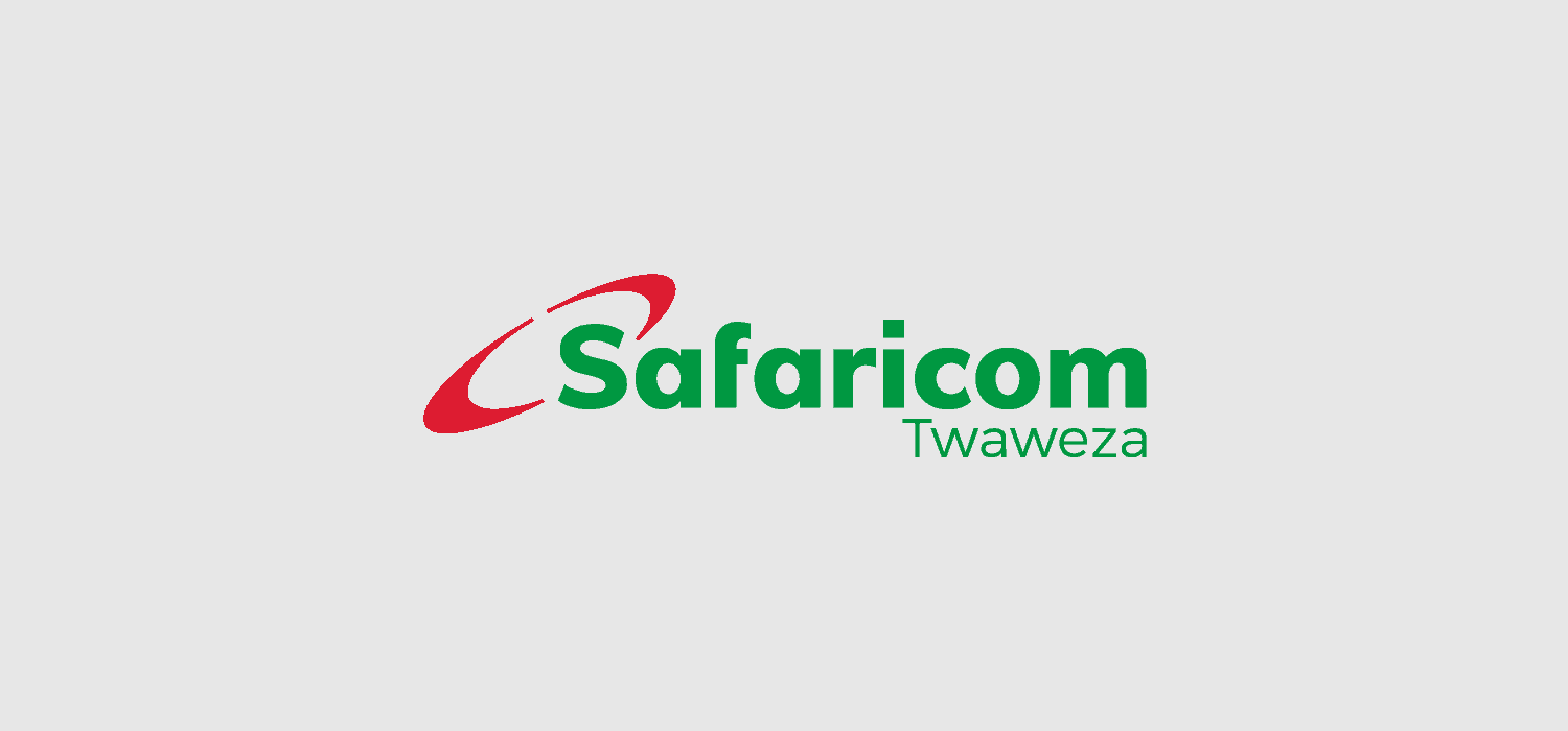
In 2017, the Safaricom logo again underwent another major overhaul, this time having the red swash cover the ‘S’ and the company typeface made bolder. The logo also added ‘Twaweza’ on the bottom right. This change also came with the revamp of the colour pallet having deep green as the colour scheme.
Some described the new logo as bizarre, yet there is a lot of meaningful elements to its design that really convey the type of company that Safaricom aims to be.
Design Elements of the Safaricom Logo
The new Safaricom logo features the red swash on the ‘S’ with the entire typeface ‘Safaricom’ being a single entity.
The swash ,which has been the common element in their entire rebranding process, is considered to denote the aim to connect people through their network.
The revamp of the logo made it easy for Safaricom to have an icon that could be easily resized, that is the (S) and the red swatch.
The colour scheme of the Safaricom logo still reflects many of the same themes as previous iterations, using crisp red and dark green to convey the message of African nature as well as futuristic technology.
Safaricom’s new logo is said to be the reflection where we’re headed together and the possibility thereof.
There’s little doubt that the new Safaricom logo will play a huge role in the company’s branding and marketing, which is why Safaricom has worked so hard to make the design elements of the logo reflective of the company’s message and their approach.
The New Safaricom Logo
For a long time, Safaricom has had an in house team of developers and designers who have worked in ensuring the brand communication and visual work are seamless.
The new visual identity was designed by their in-house design team. The new logo represents Safaricom’s slogan ‘Twaweza’ a Swahili word meaning ‘We are well able’.
While the latest Safaricom logo is still relatively new, the company is already investing a lot in it. They company invested in wall paintings and releasing billboards to make the public aware of the Safaricom rebrand.
Conclusion
In summary, Safaricom as a company is determined to uphold consistent growth and this has been strongly communicated in their mission.
Part of their challenge, then, is to remain relevant in conveying this mission to their customers, and their logo is one of the tools they are using to accomplish this task.
It’ll be exciting to see what Safaricom is able to accomplish in the coming years and equally exciting to see how the company continues to use their logo and their eye for attractive, meaningful design to push Safaricom forward.


