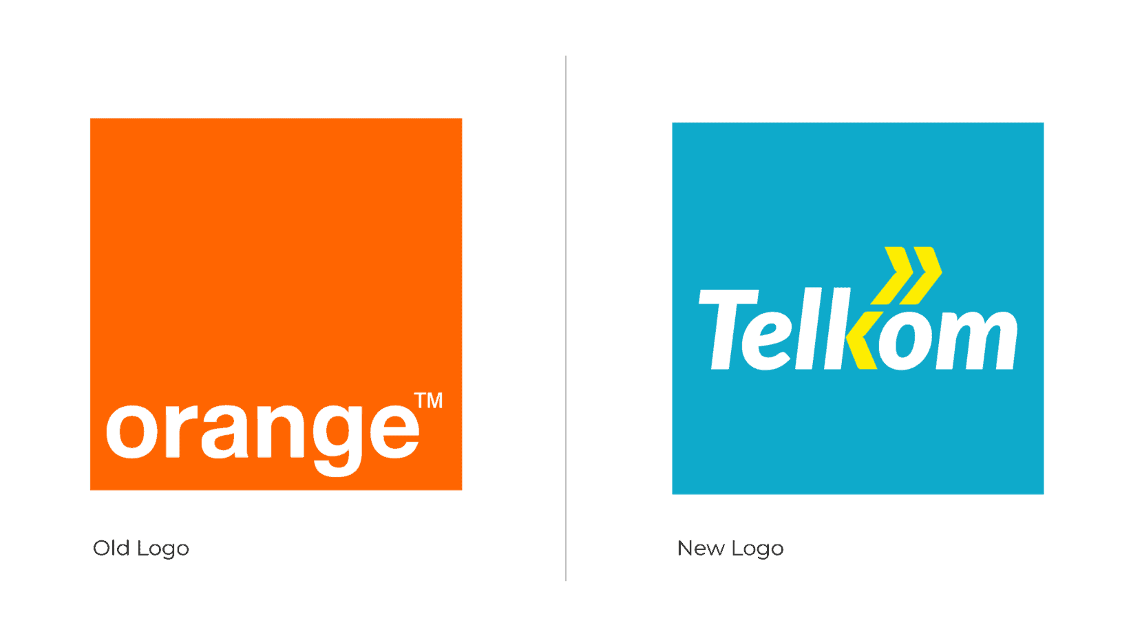
When Telkom Kenya announced a rebrand from Orange Kenya in June 2017, there was a lot of anticipation. The company’s rebrand wasn’t simply a new logo, it involved a strategic overhaul that would completely transform public perception.
Change can be surprising and divisive especially if it’s a brand you already know and love. Most clients probably wondered what the new logo would look like. What about the typography? And how would the colour palette tie in with everything else? It’s all very exciting!
Telkom Kenya’s journey to remodel from ‘Orange Kenya’ brand was a rigorous and refreshing affair.
The period of rebranding from Orange Kenya involved an investment of Ksh 5 billion on the network service upgrade. From this, Telkom Kenya got an increase in its customer share by a million people in six months.
Telkom’s rebranding alongside improved internet service made the brand even more appealing to its customers. Furthermore, the huge category of its target buyer use social media, which requires internet connectivity.
According to Telkom Kenya CEO, Aldo Mareuse, the strategic shift via Telkom’s rebrand was in response to a need to reach out to varied customer segments with the right products and solutions, reflecting current market dynamics.
Aldo Mareuse adds that the company had not reached its potential and was lagging behind. They have transformed the company by changing their company culture, network expansion, the launch of customer-centric products and incorporating innovation.
Brief History of Telkom Kenya
Established in April 1999, Telkom Kenya was among the top telecommunications operators in Kenya.
The company aims at connecting people who keep Kenya on the move. Telkom Kenya has provided this by an integrated telecommunications solutions to individuals, Small and Medium-sized Enterprises (SMEs), Government and large corporates in Kenya.
Over the years, Telkom Kenya has grown with major improvement on the vast fibre optic infrastructure, and also in providing wholesale carrier-to-carrier traffic within the country and the region.
Telkom has built a strong, consumer-centric ethos, they are committed to providing innovative, accessible and simple communication solutions that are convenient for customers communication needs.
Telkom Kenya Logo
Telkom’s rebranding came with a new logo intended to portray the new feel that was reflected in all of Telkom’s shops and offices.
As the new tagline describes succinctly the direction that Telkom is taking ‘Moving With You’ the choice of typeface also illustrate the message of movement with it being slanted.
Telkom also introduced new visual elements in their rebrand that are the arrow on ‘K’ that is symmetrical with the two arrows above it that are flipped horizontally. The concept is in the direction of moving together.
Branding Strategy
The design is all about a user-centred experience, understanding people and how they respond to design. This has been a step in building customers experience and reputation of the world-famous brand.
In getting consumers to identify the brand, Telkom Kenya adopted a multi-pronged marketing approach.
So, this involved engaging with consumers from personal interactions, public market visits, shopping centres, schools, and colleges. The reaction from the target audience was a success.
This was considered a springboard in building the brand audience through merging design and predictable human behaviour.
New Colors
In choosing the colour of a brand, it is important to note that it plays a crucial role in persuasion to purchase. Telkom Kenya’s choice to rebrand its colours from orange and white to turquoise (blue) and yellow made it appealing to a large target group.
According to the psychology of colour, yellow means optimistic and is considered a rapid moving colour.
As yellow is the most noticeable of all colours by the human eye, it is often used to grab the attention of an audience.
In addition, turquoise is associated with calmness and growth. Turquoise also has the energy that yellow transmits, becoming an appealing colour in branding.
Turquoise is also linked with a sense of trustworthiness, creating a sense of security to consumers seeking reliable services.
Conclusion
Branding is not limited to only having a logo in and the right colour swatch. It’s about ensuring that the brand message is in all communications material.
The rebrand also came with the redesign of Telkom Kenya website and mobile app with improved user-interactive and design experience. All this was to provide a coherent experience of the brand.
It is important to understand the target audience in order to provide a rebrand that suits them.
As Telkom Kenya wanted to be identified as a local product by its consumers, their branding strategy was to offer value to Kenyan consumers, rather than being viewed as a new brand competing for the market.
Did you notice any rebranding elements that we missed on the New Telkom Kenya Rebrand, Drop it in the comment section below? Let us also know of your thoughts on the rebrand.


