Oftentimes, a rebranding process is aimed to create a fresh feel and modern brand look. The tendency to make mistakes during this rigorous process is usually high. For a company such as SendGrid, the new logo would need to tell an important story about where the company’s lifecycle especially since SendGrid is so ingrained in the internal culture.
A new brand identity for a company is often a signal to the market that it may be attempting to attract new audiences or shed an old stereotype. Most times a rebrand might be a merger with another brand or trying to clarify their position in the market. With the opportunity to mark evolution of any brand, it’s important to remember a new logo for a company is typically more than what it seems.
Before the start of the rebrand, the backstory on SendGrid’s new corporate identity would key the start of the entire process.
In today’s post we cover the SendGrid newly released logo.
SendGrid’s Story

The journey of SendGrid has had significant growth from a startup of 15 in Boulder, that focused on creating the best cloud-based API email service for developers to a current capacity of 300 people, with the headquarters in Denver.
Currently, SendGrid is known to be a robust communication platform that enables developers and marketers to send emails via an API or an easy-to-use UI toolset. The highlight of it being SendGrid sends over 26B emails every month.
The evolution as a market-leading SaaS communication platform provider and a great need to introduce innovation to existing customers facilitated the requirement of a new brand identity and experience that reflects who they are.
Brief: Amplify Where SendGrid Is Going
SendGrid needed an identity that reflected the modern, high-growth SaaS company they’ve become, although they had some connection to the Mobius strip of the old logo which offers a nice inference to its ability to endlessly deliver messages to the inbox for their clients, day in and day out. The new identity also needed to reflect the one-to-many nature of SendGrid communication platform, as well as emphasize and amplify the incredible scale of the messaging grid that they operate and maintain in the marketplace.
The identity needed to sound the signal of SendGrid’s unique and dominant position as the premiere email infrastructure and marketing solution for the market around the world as they evolve their offers as a company over time. This was incorporated around the globe by making the ‘i’ in Grid reflect a #1.
The rebrand took several months with the new SendGrid logo coming with an update of the website. This, however, doesn’t mark the end of the evolving of the look, feel, and messaging of SendGrid as they target to reflect the tens of thousands of customers who would use us it every day.
Process and Strategy
SendGrid needed the new visual identity to be aligned with where we are headed. This resulted in a shift from the ambiguous Mobius strip with emails circling around it. With the new mark being built on a grid which is to represent the grid-like infrastructure in which they send mail.

The process, therefore, started with the deconstruct our current logo. Beginning from what would work for the evolution of the brand to what wouldn’t and the key areas for improvement therefore included:
- Arrows are moving backwards – the business was progressing and the arrows needed to depict positive growth
- Generic Font, not special – need for a uniqueness
- Most employees didn’t know what it is, which showed that they weren’t getting value out of the envelope concept
The strategy was clarified for what SendGrid needed to accomplish with numerous potential logo concept forming the many iterations throughout.
With this phase of the design process needed a check-and-balance, an internal focus group across the company would be mandatory to review the work. The feedback from the focus group and internal design team would therefore inform what works.
New Identity for SendGrid

The graphic elements comprised of two arrows coming together and overlapping in the middle. The arrows represent communication and the overlap represents engagement. The dark blue squares in the corner are the messages that each party is sending.
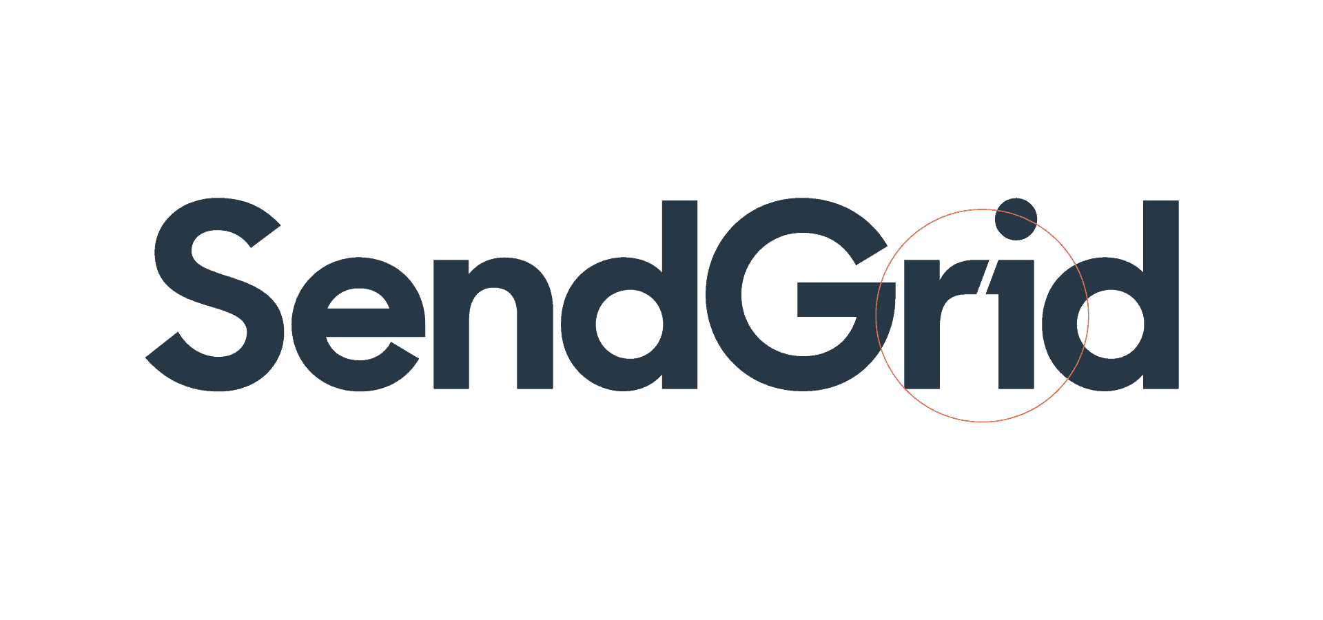
Type was another area of SendGrid to focus. They needed the type to feel more modern . Slight alterations, with the most notable being the (i) . This made it stand out as a ‘1′ that represented the message of being one platform for all your communication needs.
Conclusion
Re-design of SendGrid identity did a great job in showcasing the provision of new services and creating further awareness . The evolution of the brand hence reflected market expansion and growth.
