Warner Bros the world’s leading entertainment companies had a recent rebrand of their identity. The project had an update of the iconic shield and makes it the foundation for a comprehensive identity system, including a custom typeface inspired by the logo.
The Warner Bros logo hadn’t been updated since 1993 with the company shield seeing it through the various stages becoming difficult to use and felling outdated. As streaming has revolutionized the way media companies present their content, and the logo didn’t translate well to small screens. The company needed something that reflects its contemporary existence.
Read More: How To Determine When It’s Time To Rebrand
The survey conducted with the interview of 140 employees at every level of Warner Bros., being asked: How they felt about the brand. They also inquired on their thought on how they hold up to newcomers like Netflix. This was quite necessary to map the redesigning of the identity.
With the heritage of the company and the challenges of a new era in the TV and film industry, the team found out what resonated with all the employees is the need to care passionately about storytelling. The shield identity was also attached in the interviews sentiments.
New Identity
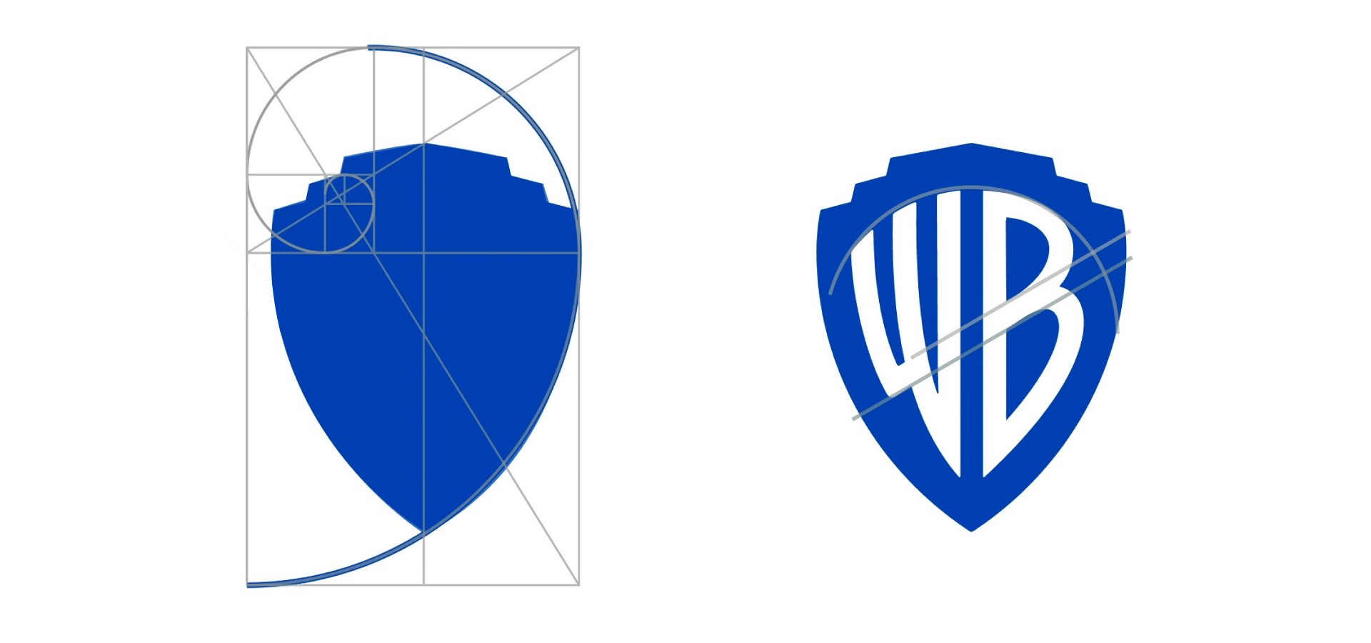 The shield identity being of importance in the pride of Warner Bros the golden ratio: a classical mathematics formula was used to provide a sleek, clean form of the shield that is close enough to the original logo. This retained the sense of brand recognition, while still conveying a modern feel.
The update streamlined the logo to its key elements, retaining the shield and monogram to prominence and losing the sash. The redesign refined the shield with a form based on the classical proportions of the golden ratio.
The construction of the letterforms of the ‘WB’ monogram, preserved their historical identity but giving it a more modern feel. The monogram letter alignment into one continuous gesture emphasizes the unity and connection of the brand.
A new typeface from the rebrand of Warner Bros. was based on the shield logo. This was intended to be easily adaptable for the Warner Bros. tradition of using themed logos for its various brand materials.
Brand Position and Visual Identity
The team also created a dimensional version of the logo, to be used exclusively for on-screen content and special cases. The dimensional mark has the clean, streamlined look of the new logo, but with a depth, that hints at the content experience.
The outcome logo could be customized for the opening and closing moments of individual movies. The optimization of the logo to clean and simple form made it successful to perform well across various platforms, scales and range of content.
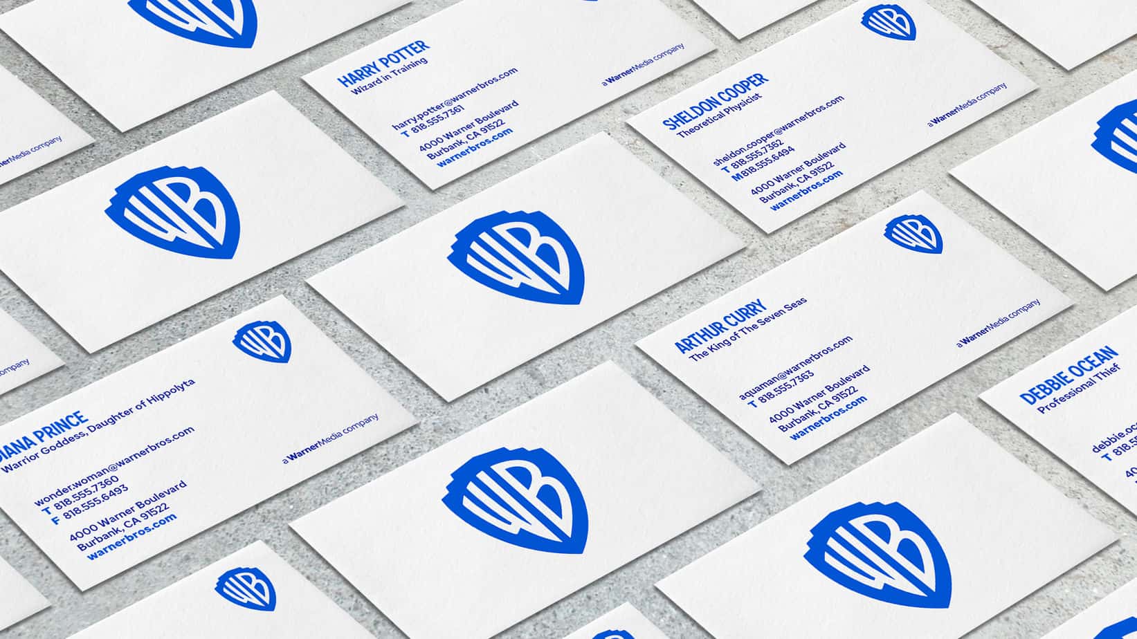
Warners Bros. Business Card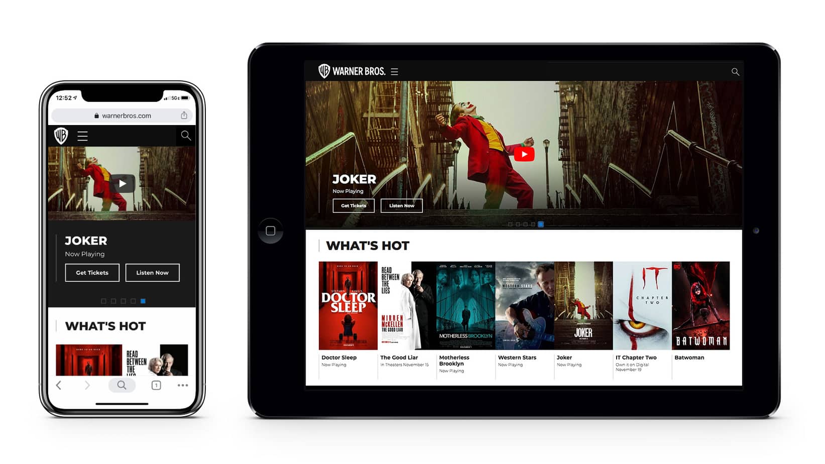
Warners Bros. Website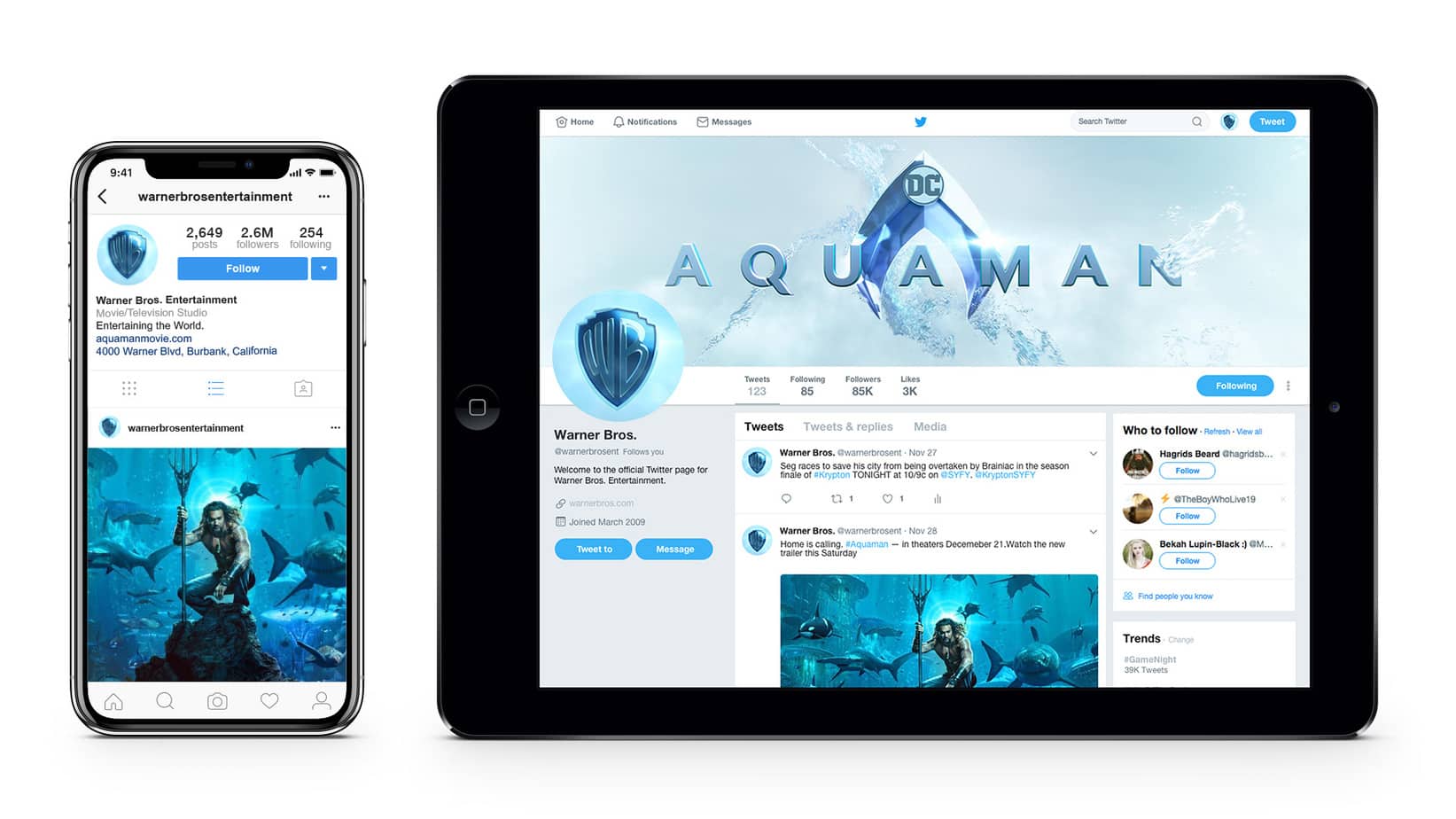
Warners Bros. Social Media
Let us know your thoughts on the rebrand of Warners Bros.