There are common mistakes graphic designers make in their line of work. As a matter of fact, many may fail to admit it.
It is easy to note that the current mode of communication is through visuals.
Physiological Tips on How designers communicate with your audience and build it.
In this era, brands have mastered building their communication channel, drawing attention and building loyalty through a visual message.
Does the problem emerge when the message created in the design process diverge away from the design principles leading to poor visuals that provoke the customers leading to a drop in sales for instance.
Although such a mistake is being made, it is important to be aware of them and avoid them in the future.
So, to help you on your journey to create captivating visual designs – ones that will actually grab your audience’s attention and maintain a connection with them.
Let’s jump into the most common design mistakes committed by graphic designers that you need to avoid.
1. Failing to draft a creative brief
Let’s agree on something.
A creative brief is the most vital document when starting a design project.
Yes, outlining what the client needs to achieve and also a point of reference for both the client, designer or organization in the design process.
A well-crafted design brief, the designer (s) can identify with the client’s expectations and familiarize with the need for the project.
But, the most common graphic design mistakes occur before projects even get started, by the failure of the designer to understand what’s required for the project.
An absence of appropriate communication between the client and the designer in most cases, contribute to a poorly written creative brief.
Appropriate communication too is an assurance of the project running smoothly.
It is indeed impossible to receive intended work first if the designer doesn’t understand the expectations. This could be resolved by drafting a creative brief and a good one for that matter.
Here is How To Write A Good Design Brief That Will Actually Drive Results
2. Bypassing to ideate through sketching
Get as much detail about what the clients want and needs, as early on as possible.
Without clear ideation of what the client wants you may end up complicating the client’s message and the whole process. And so a lot of time can be wasted working up design ideas that may not be relevant to the client’s needs.
Avoid putting the idea on paper after researching or from inspiration it may be difficult to provide a better alternative that may solve the client’s need.
The creative brief need to be able to outline this clearly to give an easy go with the research. Before sketching, get a clear understanding of the problem you are solving or the business objective for what you are designing.
The research is usually the initial stage where ideas begin to build so that you can envision what you are designing.
By sketching you can focus your ideas and make the best alternatives.
Also sketching extract numerous ideas quickly and get any concept on paper before you enter into the graphics editor to start designing the look and feel.
To work on this, read and understand the brief carefully, put down some doodle, brainstorm and try to keep in contact with the client to ensure that the design is within the client’s expectation and meets their needs.
3. Designing out of context
In contextual design consider the three groups of context elements the user, the environment and the world.
Every individual is different in the way they respond to design (The user context). As the designer develops a design (the product or process) it is on whether every user likes, hates, owns it. This extends to the user’s emotion and state of mind either (bored, happy, etc.) and their habits.
The product or the process designed need to fit within the environmental context. The designer needs to consider any physical aspect that may influence the design. This is by being keen on the time, the day, the location, the place (home, work, shop, etc.) and other networks or devices that relate to the design.
The world context by looks at what is happening elsewhere and how it may relate to the user, such as sports events, weather, traffic jams, a TV program everyone’s watching, or something trending on Twitter could inform contextual thinking approach.
Great design should be a natural extension of the messaging, and its implications should be plainly expressed.
Obviously, there’s no guaranteed way to impress every customer 100% of the time, epic mistakes can be minimized by doing your homework and identifying with the design project previously worked on in your industry.
So, not every piece of data would be relevant to every project, but previously done work could benefit the contextual approach way of thinking.
4. Poor handling and saving in the wrong design format
When a design client comes back to the designer complaining that their print output or the website design files are not as expected, it’s pretty embarrassing.
As the professional, it’s your responsibility to handle the design files, and any technical insure that arises and not the client.
For most of the design project such as branding or logo design, the common problem occurs when the successive designer fails to manage the original files handed over to.
In ensuring a smooth running of the successive designer, there are rules in creating, saving, sharing and handing over any design files.
When choosing a file format, think about the final format and how the file will be compressed. Most of the design files are used either for print or on the digital display – Therefore with these applications, it should be easier to choose the best way to save work.
In most cases, it is usually the designer decision in ensuring the client’s message is passed correctly.
The general rule is, for print save your designs as CMYK while for web save in RGB.
In deciding the right way to save your design files either in Joint Photographic Experts Group (JPG or JPEG), Portable Network Graphics (PNG), Portable Document Format (PDF), Adobe Illustrator Document (AI), Encapsulated Postscript (EPS), Tagged Image File Format (TIFF), and other formats, it will depend on how the file will be used.
?5. Committing typography and fonts Mistakes
If you want your design to attract attention, consider the user with their ability to read it clearly.
But sometimes it’s easy to get so caught up in the design process that you dwell much on the aesthetic and fail to consider its practicality. For example, thin, white text on a black background might look sleek but can be hard to read.
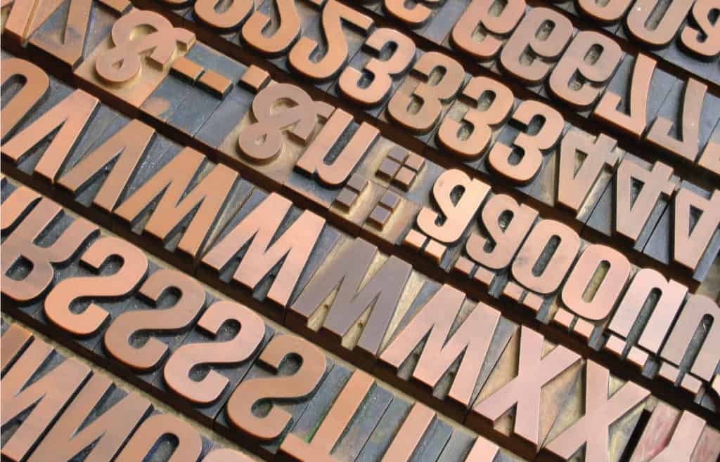
Legibility issues can come in many forms – a font could be too small; stretching or condensing words to fit into a certain space; the font and background colours might clash, or transparency effects might make text hard to see.
Dealing with typography is about creating a balance between the white space and typeface, so overlooking the design of each section with text would make the overall work un-proportional.
Some designs call for a decorative mix of typefaces, but most won’t.
This is the way to identify with the professionals, a majority of their design projects benefit from a limited number of fonts – two or three is the good rule of thumb.
Too many typefaces and styles of fonts could make your design feel and look like an amateur.
To be on the safe side stick to a more conservative approach to typography, keeps your design looking clean and organized instead of cluttered and chaotic.
To ensure you don’t start your design on the wrong note make sure to your type proportionally. This way you will avoid distorted letters giving them unnecessary shape.
In dealing with ‘orphan and ‘widow’ typeface workarounds would include adjusting the font size and/or tracking to fill a space more effectively.
Here is Typography Made Simple: A Step by Step Guide
6. Failing to do a checklist
Every professional designer master the practice of going through a checklist and ensure the client’s expectation and the look of the work is a check.
The creative brief could form part of the checklist once the design work is completed.
So, a second check on the final design could save you in case of misspelt in your work. For instance, logo design with a wrongly spelt name of the client’s company could evoke ridicule ruining the reputation of the brand.
Use the spellchecker in sorting out misspelt words within your work. This comes with a setback in the case of a wrong context. Reading through also could help in limiting any of these mistakes.
Taking a design and handing it to a client directly is not the way to nail your client project presentation. Have in mind a checklist as well as preparation for the meeting so that your project proposal to most likely to come across as intended.
In a presentation, be at the top of your game ahead of client meetings so that you will feel comfortable, confident and increase the chances that your project (or proposal) will make a great impression.
7. Failing to identify the limits in the designing process
Simplicity is often overlooked and a concept that is not easily adopted by most designers.
Here are The Ten Principles For Good Design
The best design conveys information clearly, and simplicity.
When a design is overdesigned, it can be harder to communicate the message intended. Incorporating too design style, fonts, colours may cause a conflict of the eye, while too many images can make it difficult for viewers to know what to focus on.
You want your design to stand out?
Overdesigning and the desire to make it extraordinary may end up being a bigger problem distorting the overall concept more than it helps. Most designers nowadays are trending toward more simple, clutter-free designs, as they return to simplicity.
According to Dieter Rams ideology, good design is as little design as possible. This is because it concentrates on the essential aspects, and the products are not burdened with non-essentials. This goes back to simplicity.
8. Focusing too much on popular design trends
Keeping at par with the latest advances in design is quite essential for any designer who wishes to remain at the top of their game.
However, in some instance, it’s such a bad idea to try and replicate a style based on its popularity or success on the company using it. The fact is some of the design trends fail to stand for a long time and might become outdated.
Rather than choose the popular flavour of the month, think about what’s more likely to have longevity for your brand.
The designers focus need to be on utilizing creativity and style to develop designs that will resonate with the target audience.
It’s important to look for inspiration, that would stir the designer to provide a unique solution to the design project expectations.
Conclusion
Your design should look great. However, that doesn’t mean errors can’t emerge in the process.
Ideally, you should always avoid some of these simple mistakes graphic designers make that quickly influences your marketing.
Doing so you will have a better hand in your message and CTAs to sink in your customers as you make sales.
Next, your design should be easy to understand.
That means a simple design, with little visual cues, can remind visitors and communicate what they should be done, whether on the page, or your product on the display.
Which mistakes as a graphic designer have you made before? How did you curb it??


