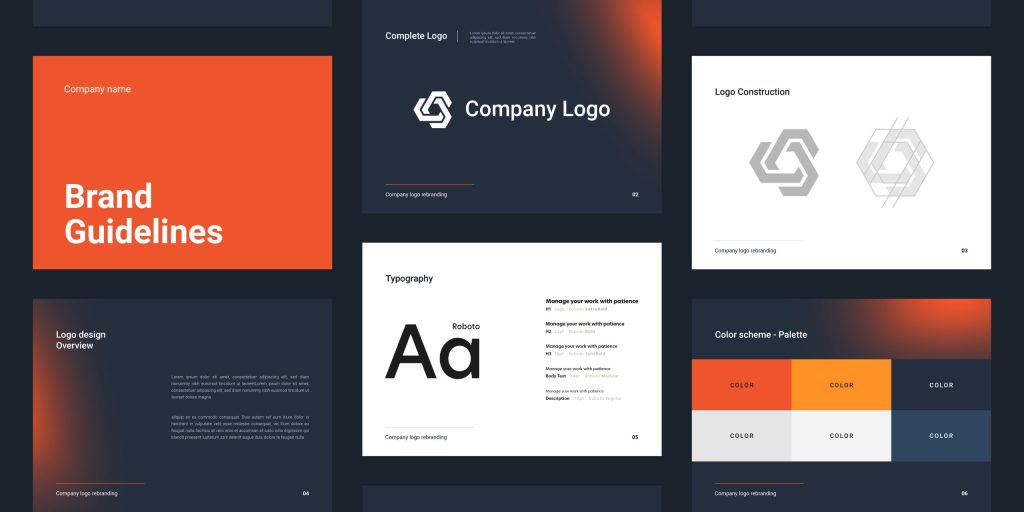
The logo being the most visible symbol of a company should stand out from your competitors. It not only reveals a business’s identity but also invites a potential audience to get to know you.
While logo designs don’t change often, designers need to keep them modern and chic to resonate with the ever-changing consumer buying patterns. It’s no longer about creating logos that resonate with a brand’s identity only but designs that leave a lasting impression on an audience.
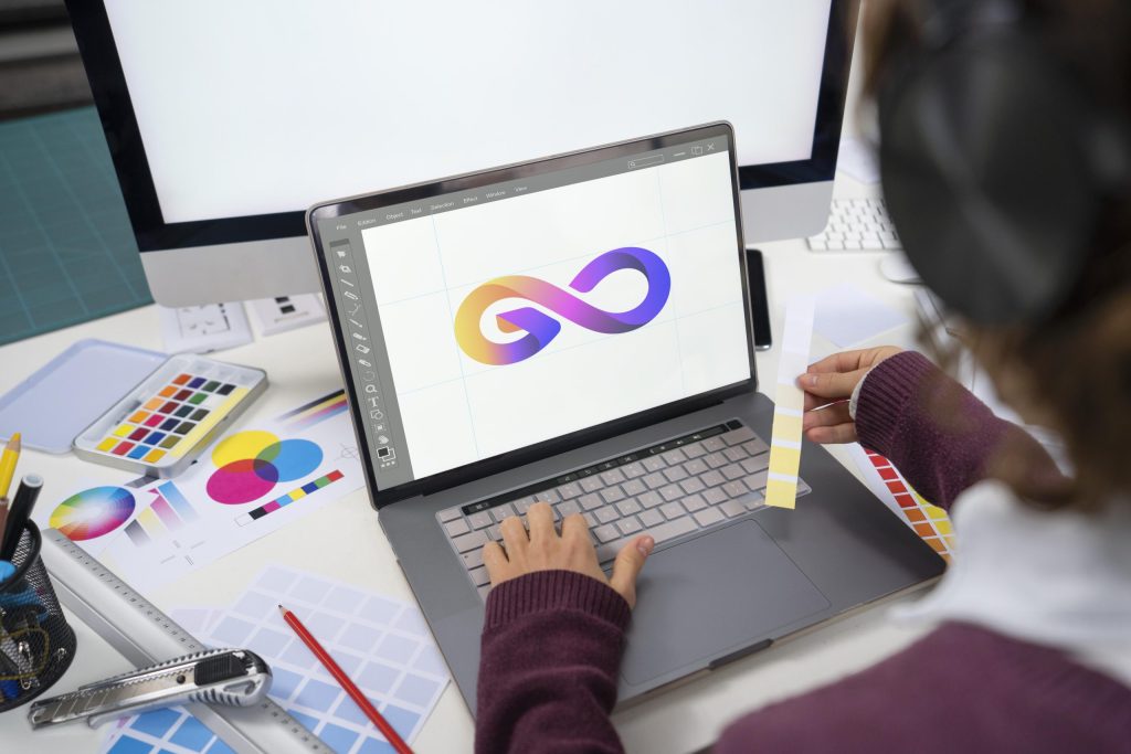
Colours, style, shape, and typeface, among other factors, play a critical role in creating the desired impact on your audience.
2020 marks the beginning of a new decade, and so do aspects regarding logo designs. Experts predict a mixture of old and new trends characterized by the use of chrome and the 80s neons juxtaposed against black and white images. Before looking at these trends here are features that will mark the 2020 Logo design trends:
- Simplicity: New designs will have fewer details to create minimalist logos that are easy to recognize
- Unusual fonts: The logo designs will also have custom or unique fonts
- Geometry: Designers will also use geometric compositions instead of squares and circles
- Cluttered designs: Logo adapting this design will create the illusion of motion and depth within
- flat designs. Using different angles, shapes and colour tins, for example, create the illusion of movement
- Scaling: This is another feature that will create more depth, direction, and weight within the logo
Top Logo Design Companies Of 2020 according to DR
Design Trends to Look Forward to in 2020
Minimalism
![]()
The trend has been popular for the last three or so years, and it seems to linger on in the graphic design industry. Minimalist logo designs are characterized by lines, dots, curves, dots, and squares, and sometimes include a colour scheme to make them more memorable.
- Squares: Brands using logo designs with squares convey a sense of balance and stability.
- Circular logos: While curves and circles are basic geometric shapes, they convey a powerful meaning symbolic of perfection, completion, and infinity. The designer may combine the shapes with thick fonts to make a bold statement.
- Line-based logos: They echo the minimalist style perfectly. When used to create logo designs, they symbolize simplicity, freedom, and energy.
- Curves: Since they are curved lines, they are associated with creativity and dynamics. However, designers intend to use chaotic curves, parallel curves, and decorative curves to add energy.
Related Article: The Warner Bros. Shield New Logo and Identity
Responsive Logos
Digital advertising continues to evolve rapidly. Today businesses are creating ads tailored to mobile platforms as the broader population is shifting to the use of mobile devices, not desktops. This means logo designs that are not responsive to the tiny mobile platforms may not be effective in modern times.
Responsive logo designs are thus the way to go. They appear less embellished, retain simplicity and readability. If the standard logo is displayed on a desktop, however, it looks big, and more of its details are likely to appear. Responsive logos, on the other hand, are not restricted to the size of the mobile device.
For example, when a user logs in to their Google mail inbox, an icon appears at the top right corner. However, the icon looks different on a personal account if the user signs into a business account.
3D Gradients
 Gradients enable designers to convert simple logos into attractive visual interpretations. The natural transition of colours makes the logo appear more dynamic. Designers can use either of the two gradient designs:
- Integrating multiple colours: It involves combining bright and vivid colours to create beautiful palettes. The colours can depict natural phenomena like a futuristic look or the colour of the sunset
- Analogous gradients: This design involves using one colour or a limited colour scheme to keep the logo simple. The designer uses various nuances of the same colour to make the logo more interesting
- 3D gradients: The designer can also use 3D effects to create depth. 3D logos are popular in the smartphone industry as they don’t have to worry about how the logo appears on paper
Animated Cartoon Logos
![]()
This kind is used to create an exciting and cheerful mood. As such, brands looking for acceptance often use cartoon logos to win the hearts of potential clients. And this time, designers are not only creating fun cartoon logos but also animating them. Some ways of incorporating cartoon logo designs include:
Outlining cartoon styles: The designer may decide to sketch cartoon illustrations using thick outlining to make them fun and exciting
- Doodle cartoon style: This style resembles hand drawing using a pencil. When converted into a logo design, you have simple pictures that can be made by hand
- Flat cartoon style: This style is ideal for designers who want to create simple logo designs. You can some detail by adding fun and engaging animations
80s Throwback
The year 2020 logo designs will also be characterized by some of the 80 logo trends, including neons, chrome, and pixels. Designers may also include old-school technology that preceded the popular glowing rectangles.
![]()
The idea is to capitalize on an audience’s nostalgia as the 80s style is now regarded as cool and fun. As more people build up cassette collections for their vintage arcades, it’s a great time to leverage the 80s style.
Use either of the five logo design trends (gradient, animated cartoon logos, the 80s throwback, minimalism, and responsive logos) to give your logo and the entire business a fresh look. Keep in mind an essential feature to help you create a design that resonates with a modern audience- minimalism. You can use one or mix them up to not only create a visually appealing logo but one that leaves a lasting impression.
Tips: Fundamental Tips You Need to Master in Logo Design
What are your most preferred logo design trends? Give your opinion in the comment below.