The global cross-border and currency payment services provider Western Union company has launched a new brand identity which comes with a new logo and a monogram.
The newly-announced Western Union business solutions are set to offer small and medium-sized businesses (SMEs) access to its services. This is expected to allow businesses to carry out international business payments online in 140 currencies on a permanent basis and offer real-time foreign-exchange rates, as well as several tools for SMEs, such as market newsletters, webinars and whitepapers.
Brief History About Western Union
Western Union has offered international business payments services via the international B2B payments provider Custom House and under the latter?s name since 2009.
Western Union platform has connected the digital and physical worlds and made it possible for consumers and businesses to send and receive money and make payments with speed, ease, and reliability.
In 2018 from their channel westernunion.com was able to grow its traction in more than 60 countries including Kenya, plus additional territories, in moving money around the world.
Western Union in 2018 alone moved over $300 billion in principal, this was nearly in 130 currencies processing 34 transactions every second across all its services.
With its global reach, Western Union focus has been in moving money for better, connecting family, friends and businesses to enable financial inclusion and support economic growth.
Western Union Rebranding
Since its last redesign in 2013 which introduced a ?WU? monogram, this has taken a great turn in defining the identity of the currency payment services provider Western Union Company.
The rebrand encompassed Western Union dropping the extra bold uppercase type with loosely-spaced letters wordmark to a title case wordmark and with light typography.
As the old monogram had the challenge on how it dealt with the intersection of the letters ?W? and ?U? with a thin black line between them, the rebrand solved it by having it to be distinct, bland but fine.
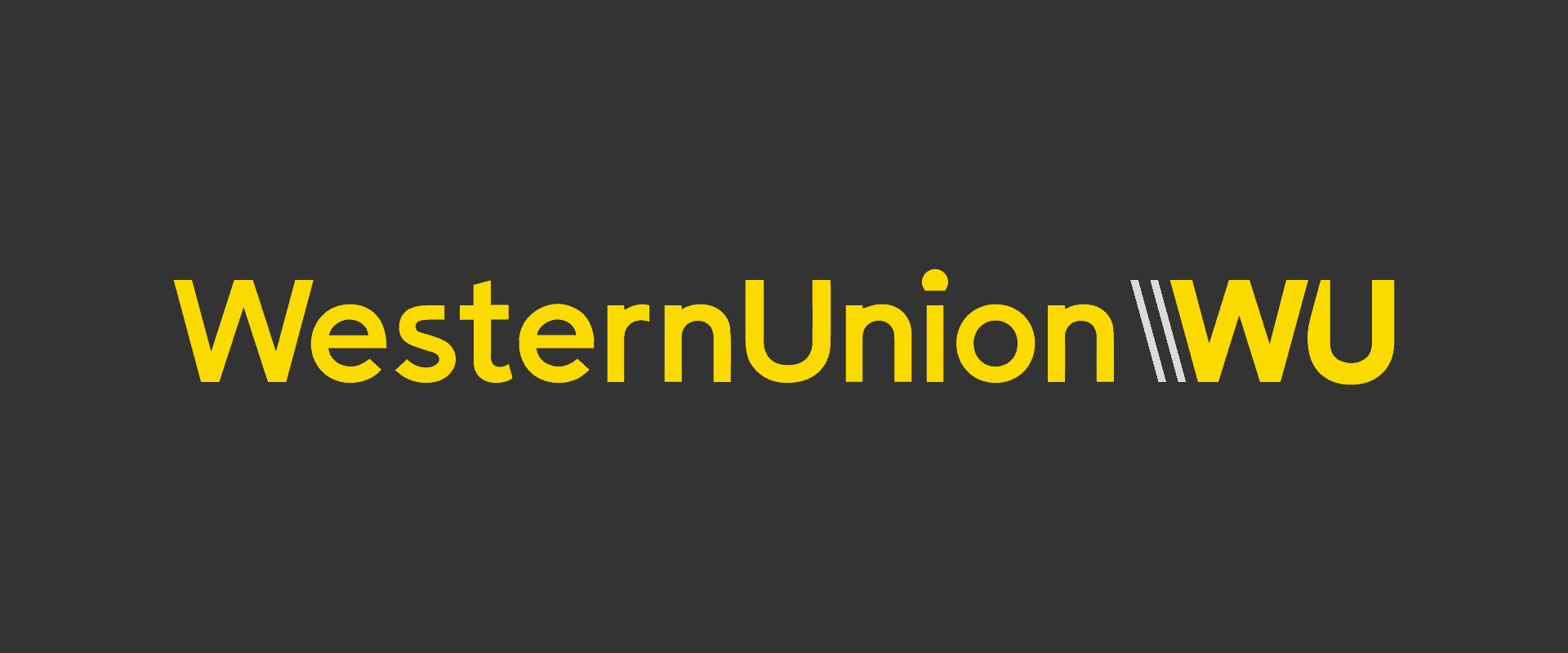
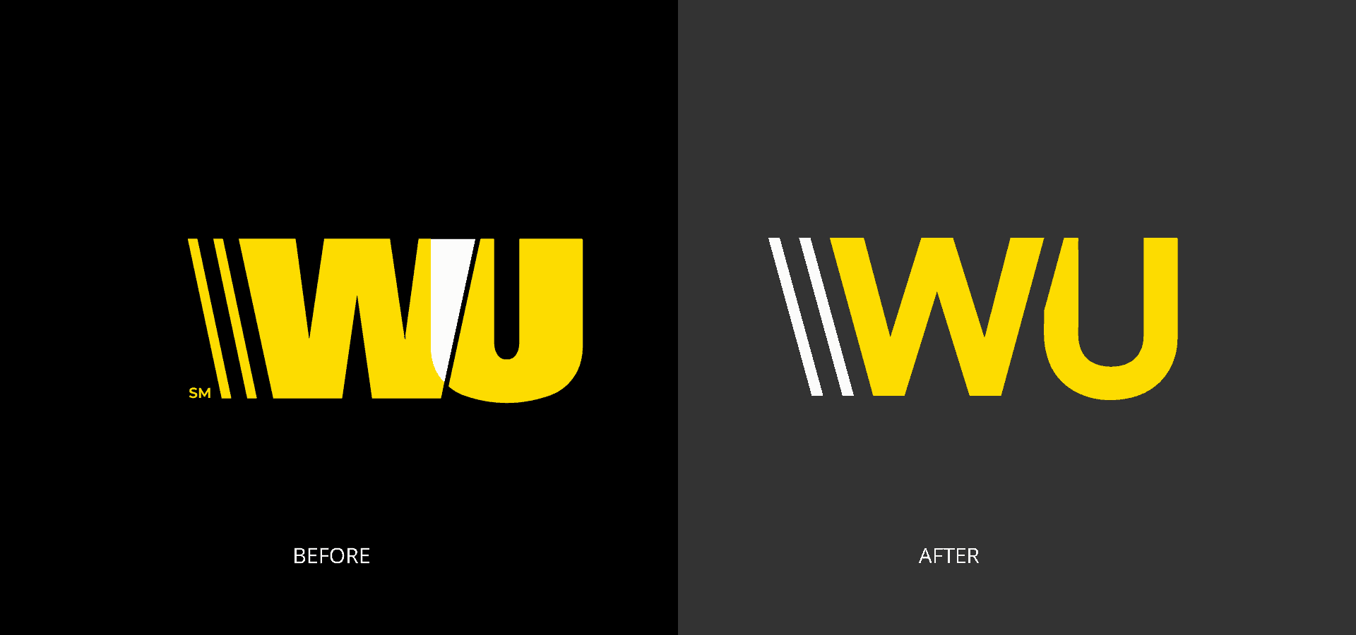
The wordmark also had unnoticed modification on the ?s? and the ?i? which don’t have a defined modification on how the logo stands out as much as it doesn’t have to harm the identity.
The consistent branding colours have made it stand out, especially in the smaller towns where they operate.
